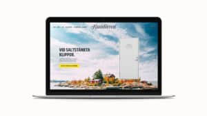
Challenge
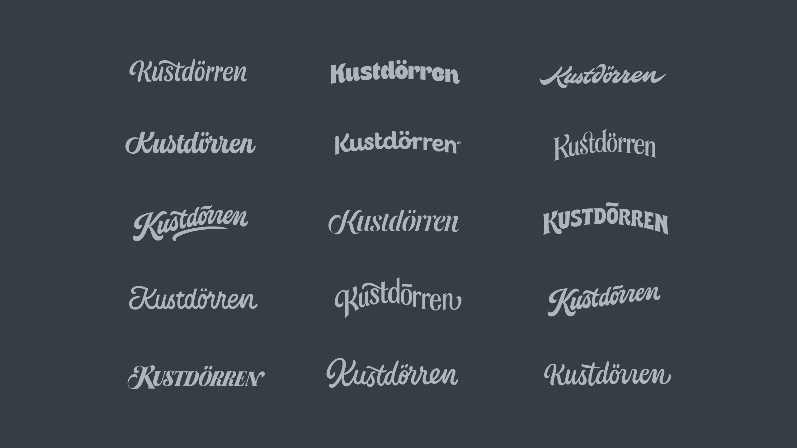
Craft a hand-drawn logotype for Kustdörren – a new brand developed by Dieden Ekodoor. Kustdörren is specially designed to endure the tough climate along the Nordic coasts. The logotype shall have a premium feel, visualise craftsmanship and quality – and at the same time it will flirt with the pride of living near the coast. Furthermore, the logotype should not be too graceful and fragile – but also not too hard and boxy. It shall feel inspiring and positive! Dieden Ekodoors existing typeface Khand shall work together with the logotype. It needs to work in one color as well as inverted in white. Since it is a new brand, the legibility/readability is very important.
Solution
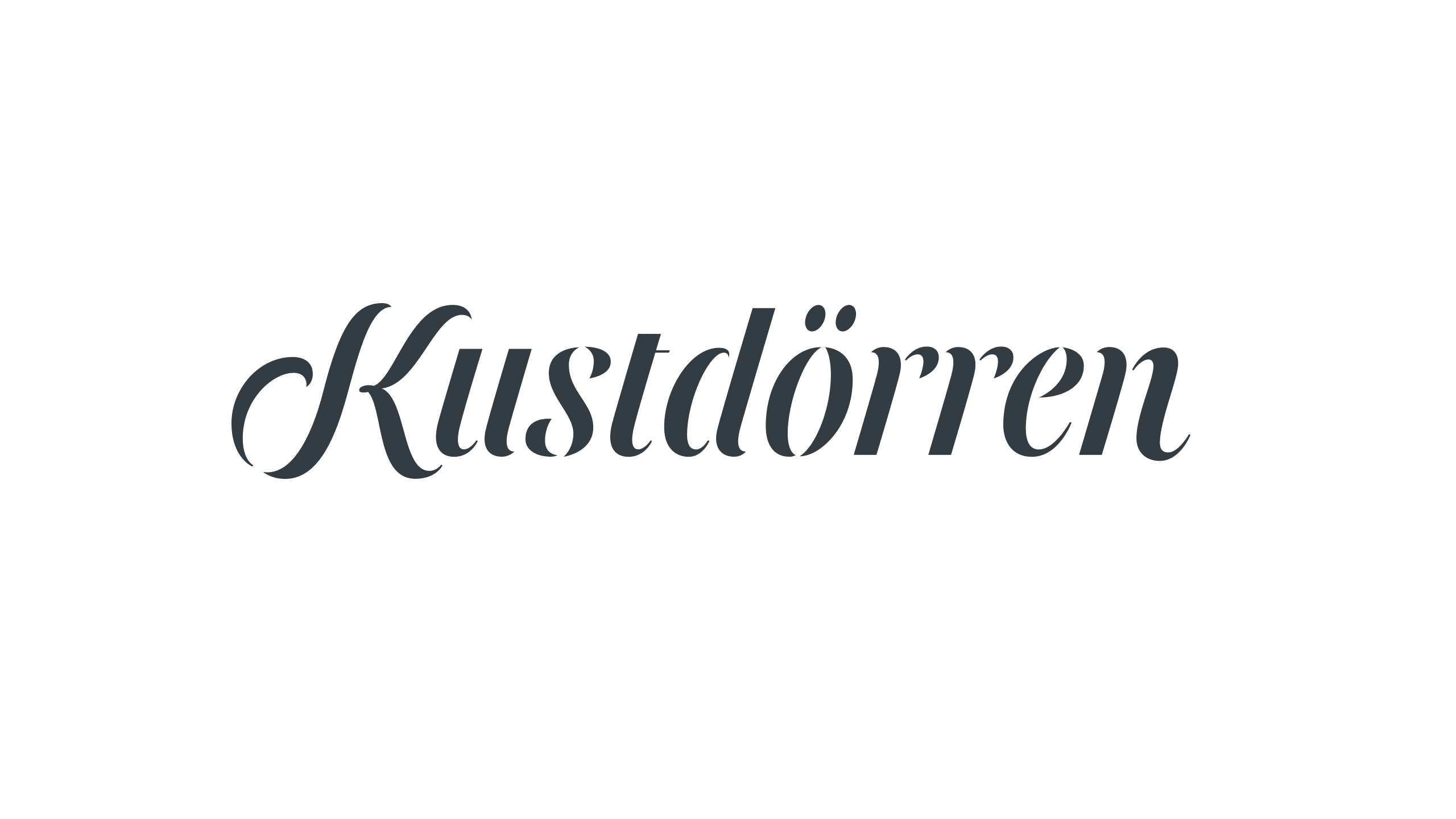
After having explored different design directions we landed in a stencilled script. The design is robust, but at the same time elegant combined with a high level of legibility. The “swirl” in the initial K makes you think of winds and waves lapping in. In a subtle way the sort of disconnected letters could remind the viewer of a patina that has emerged over time; they have been around a long time and has become only more beautiful with age – just as Kustdörren will be.
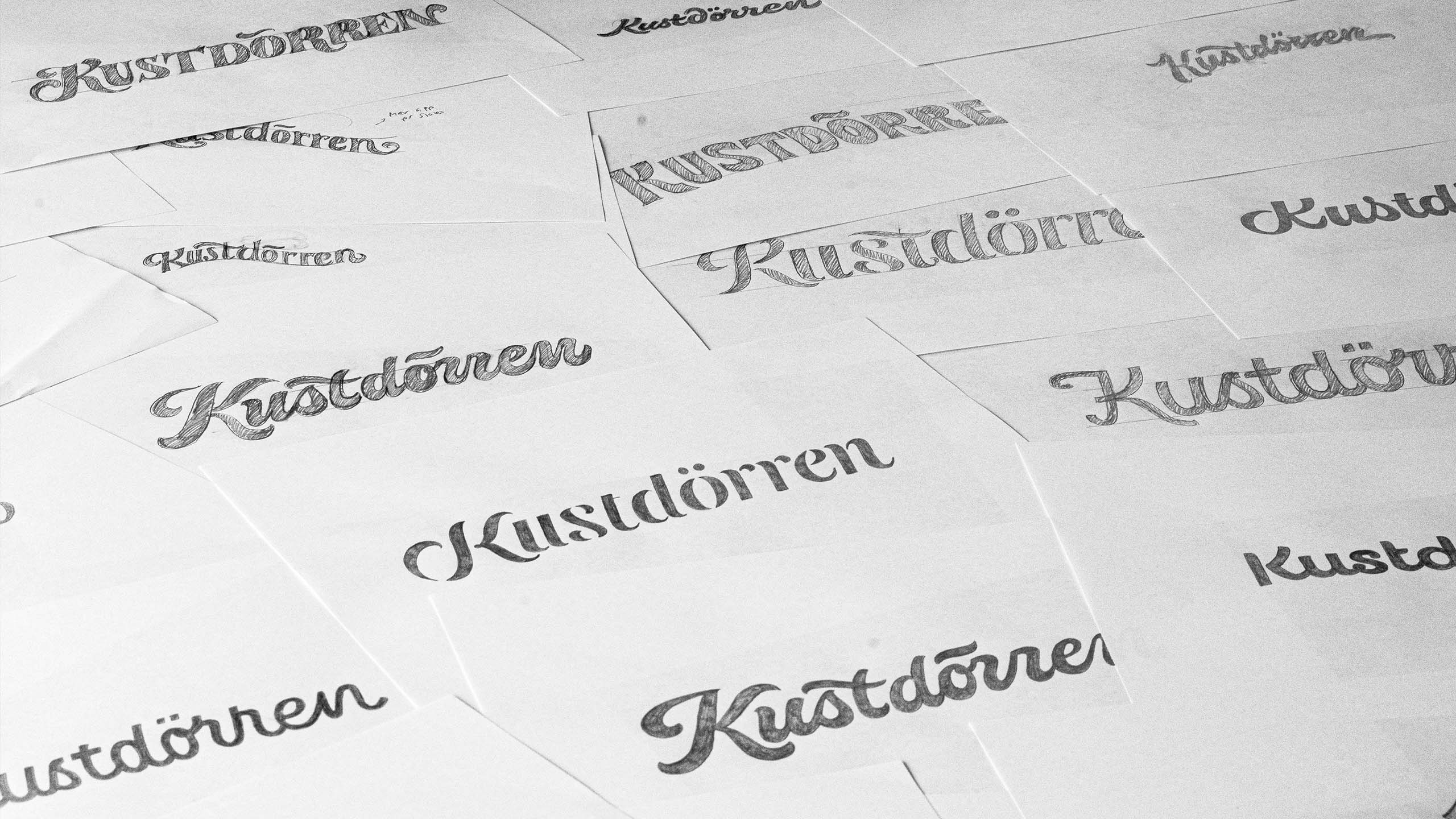
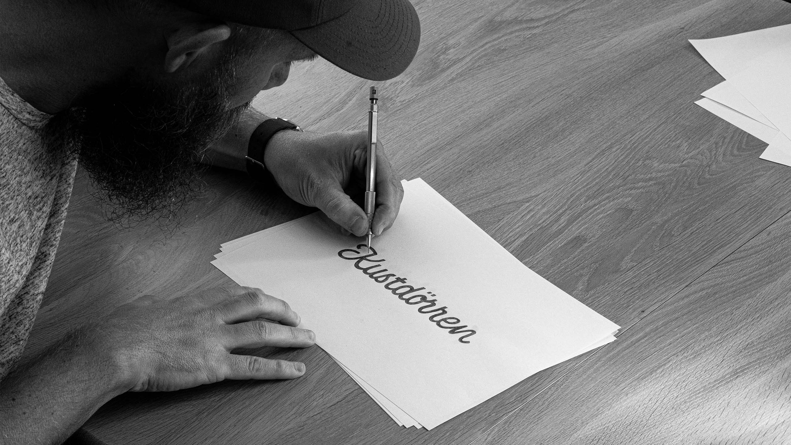
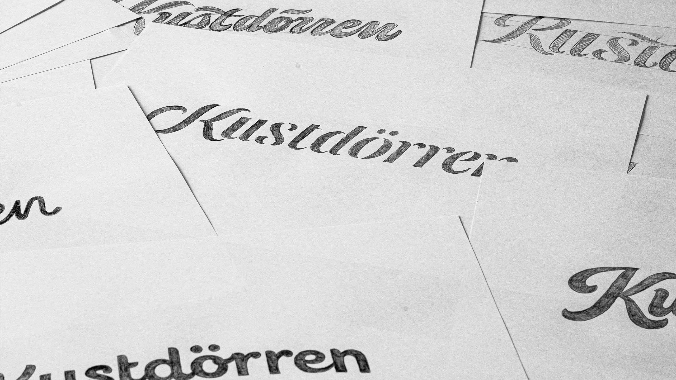

The genuine craftsmanship. The hand-drawn sketches makes every typography unique and it also gives it more life. And you are good at listening, but at the same time make your own interpretations. Prestigeless, responsive, creative and professional. We are very pleased with the result”
Andreas Noreklev,
Art Director at Rabadang


