Challenge
Create a visual identity for Booking Elite (BE). The company will provide an online marketplace offering holiday stays for travellers (think Airbnb, but with lower commission). The customers are people from all levels that wants a home for a holiday. The customers will be reached through marketplace, online advertising and social media. Some of the more important competitors are: Airbnb.com, booking.com and propertyfinder.com. The brand should be associated with the words great, trustworthy, professionalism and price worthy.
Solution
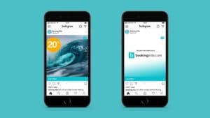
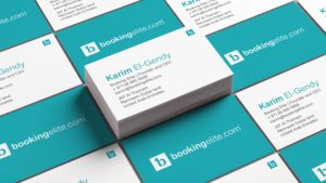
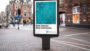
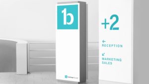
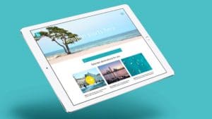
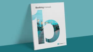
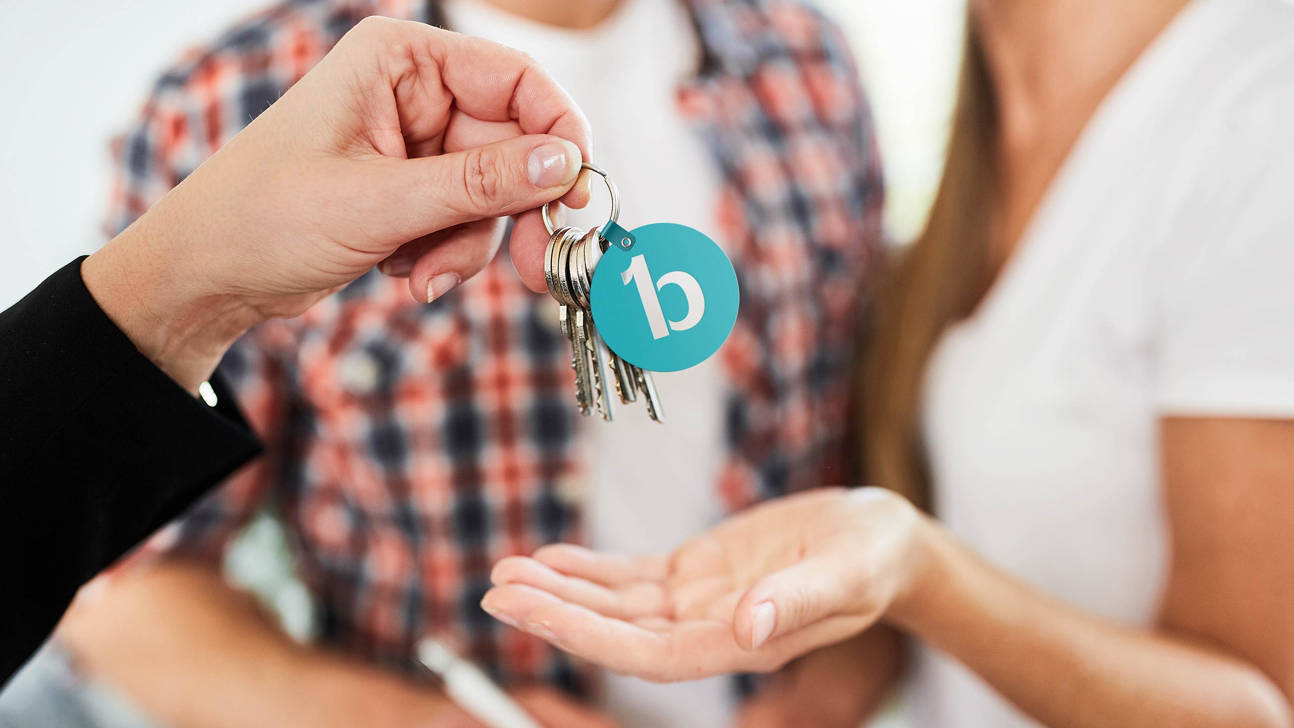
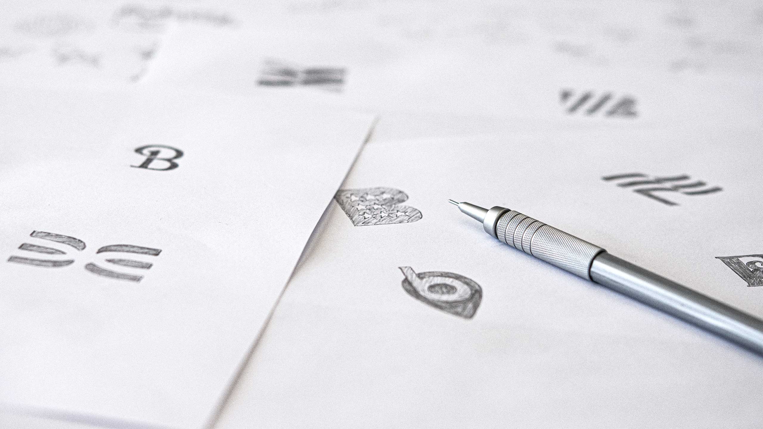
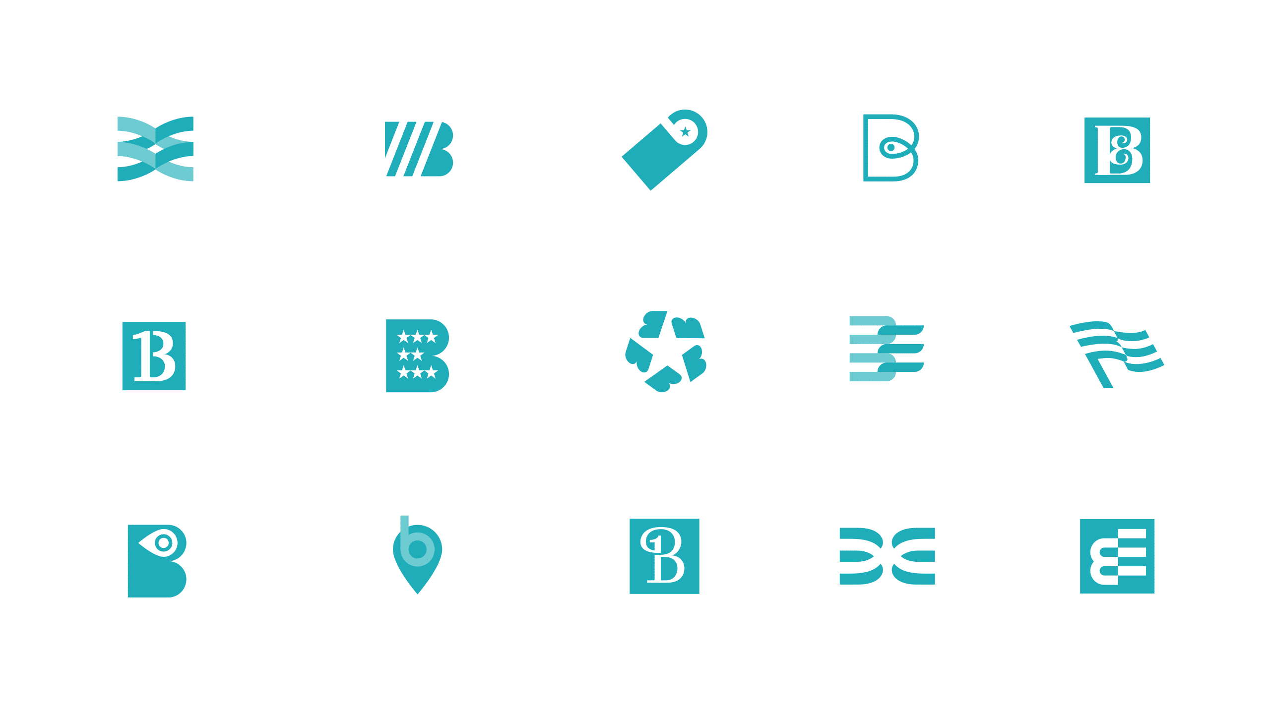
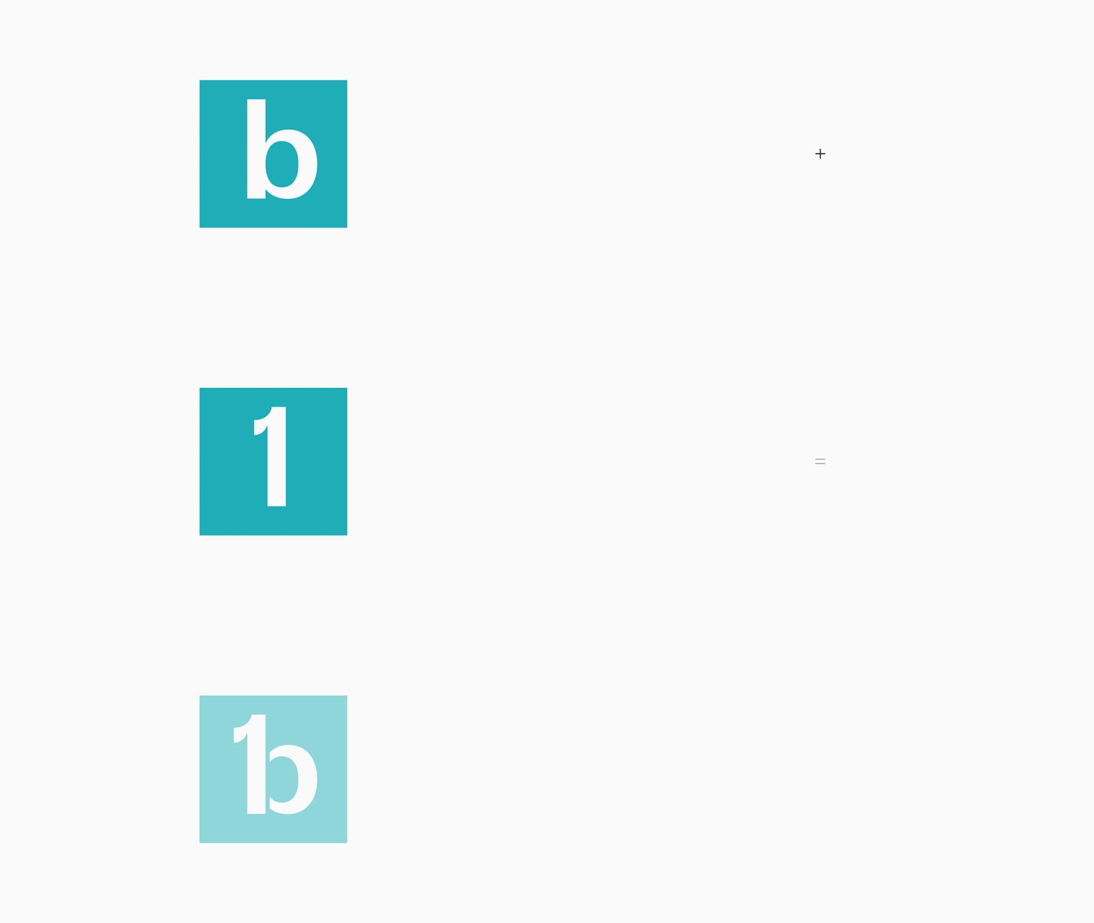
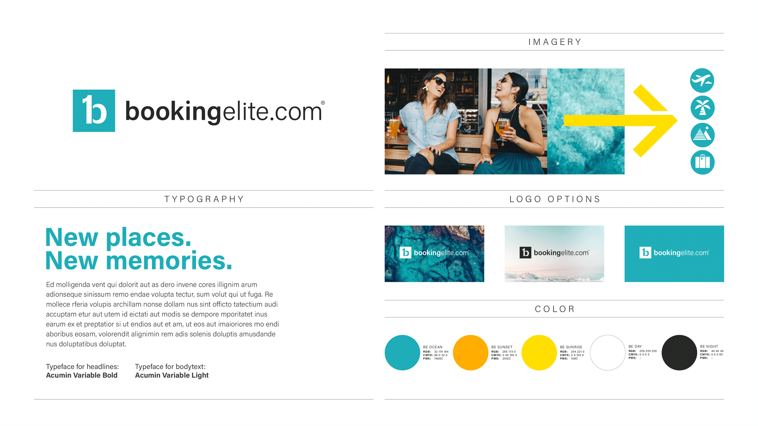
The identity has a strong and simplistic look. I wanted a living identity that breaths vacation and holiday. The BE symbol combines a lower case ‘b’ for ‘booking’ with a number one to symbolize ‘elite’. The symbol is accompanied by a classic sans serif typeface to add trust, stability and clarity. Turquoise, taking the best from green and blue, is used to enhance the feeling of trust, and also add feelings of friendship, energy, sophistication, wisdom and joy.
I have worked hard to create an identity that you can place branch-wise, but at the same time signals something new and exciting. The identity is stylish and clean, but at the same time also bold and strong. As every well-crafted logo shall be, the BE logo and identity are easy to recognize and remember, even in cost-effective one colour print. Also, it works well in the shorter monogram version for social media and other small size places.
I am so happy that I decided to work with Björn. Well done, I really do love it and love the colours! Thank you again for the great job.“
Karim El-Gendy,
General Manager and Founder of Booking Elite Limited


