Challenge
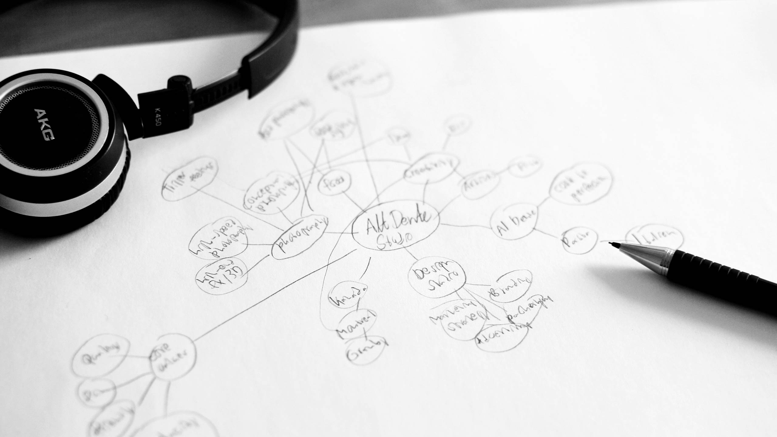
Redesign the logo for Alt Dente Studio. The company is a small award-winning photo studio based in Montreal, Canada. Currently Alt Dente Studio is doing 50% food photography and 50% food branding. Their work is characterized by lots of ideas and creativity. The new logo does not have to resemble their old logo. The target customers are in the food, wine and liquor industry – from local stores to large industrial companies. Their competitors´ branding are pretty strict, none of the competitors have a dynamic lettering logo. In fact, Alt Dente Studio see themselves as a sort of a punk alternative to their larger competitors more slick approach. Alt Dente Studio´s core values are quality, fun, audacity (i.e. boldness) and friendly.
Solution
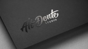
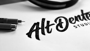
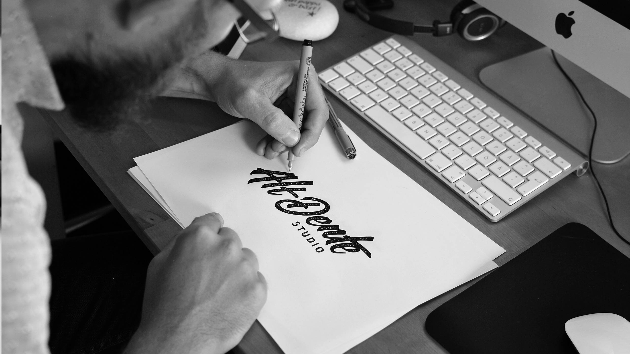
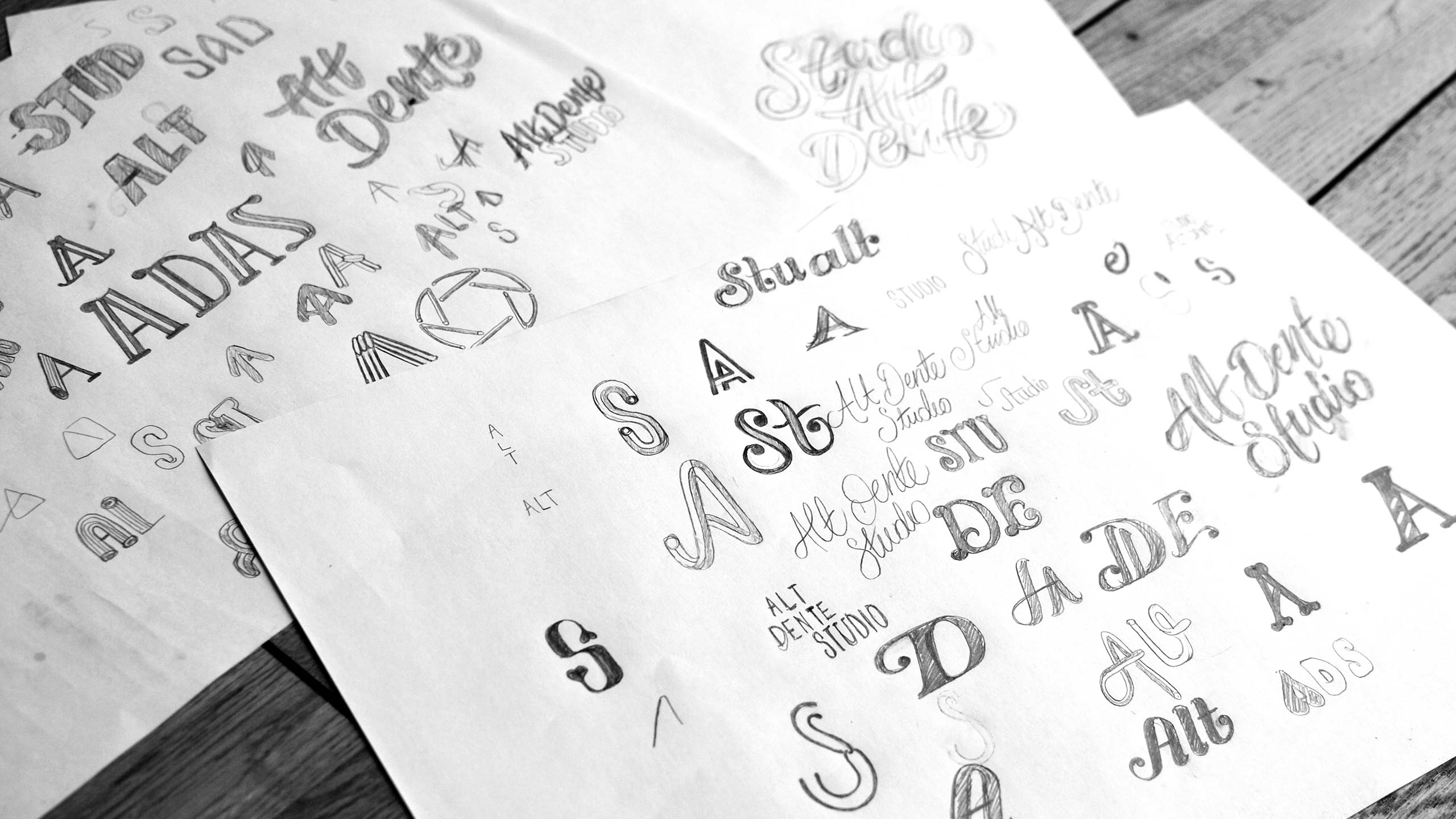
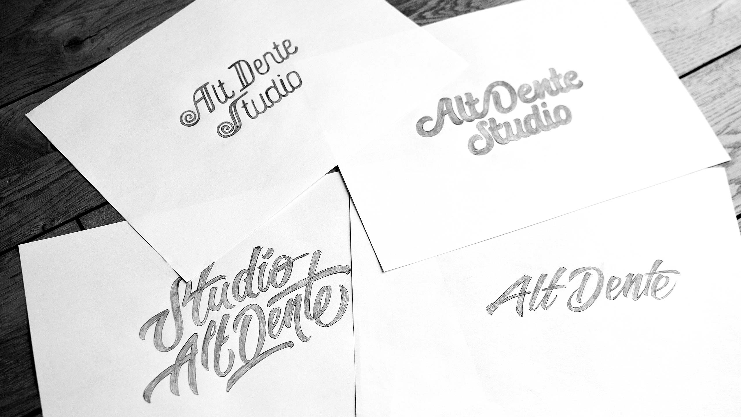
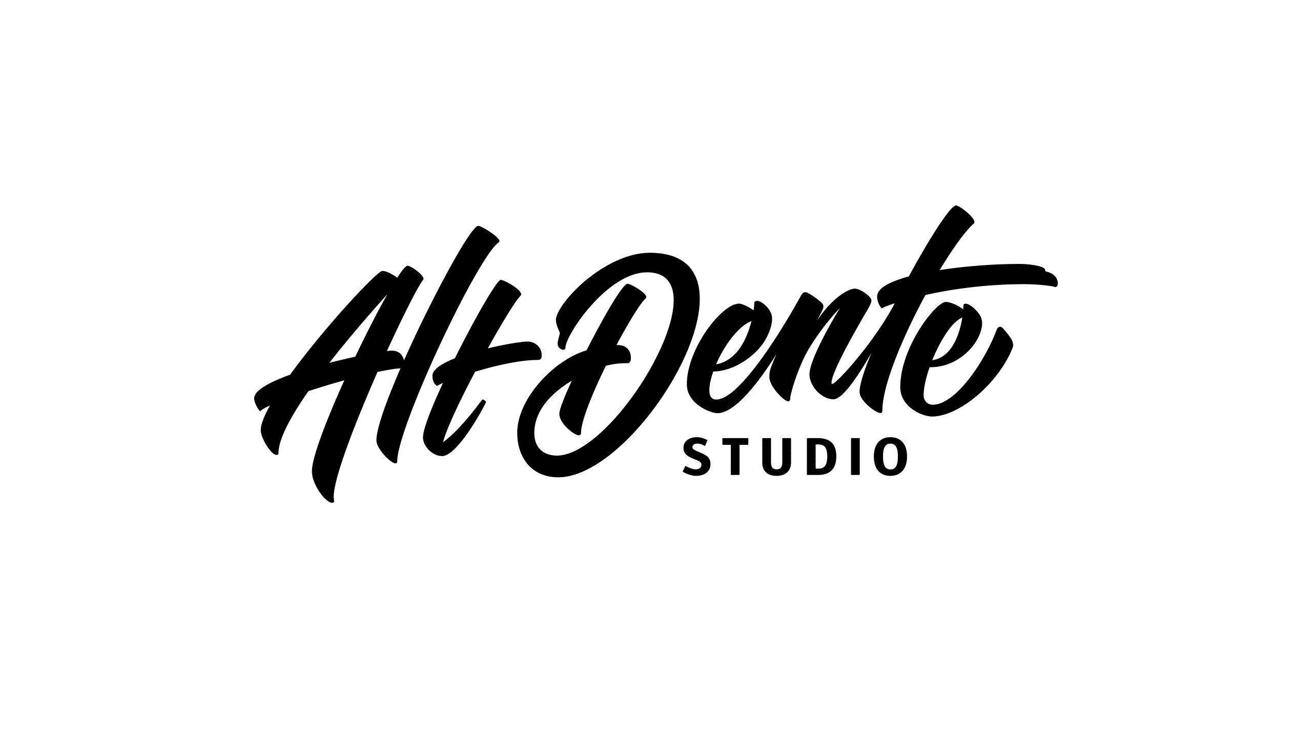
The visual expression goes hand-in-hand with their work and their core values. The quality factor is very important for the customers of Alt Dente Studio – hence a lot of time has been used to craft the small details of the logo, to make it a top-quality logo. Also, I wanted to make sure that is an inviting logo that welcomes you. Therefor the lettering has a balanced friendliness yet keeping it bold and keeping it real to the soul of Alt Dente Studio.
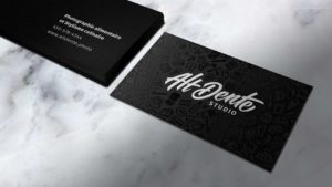
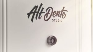
The logo is carefully designed to make it legible in very small to large sizes. Tested in tiny versions, in print and web mock-ups, and in large printed scale too. The lettering of the logo differentiates Alt Dente Studio from their competitors. The dynamic lettering in this logo redesign signals creativity and a different way of thinking as compared to their competitors.
With this beautiful lettering logo, we have gained a lot of confidence in our brand, now we want to show the world our great looking business! Björn is patient, friendly and honest. He delivered perfectly at an affordable rate. In fact, if you are looking for a talented lettering artist, do not waste time and money elsewhere – go for Björn!”
Sébastien Dubé,
Co-owner of Alt Dente Studio


