Challenge
Lina Högberg, Art Director at Magasinet NEO, wanted a hand-drawn design for the cover of their magazine.
Solution
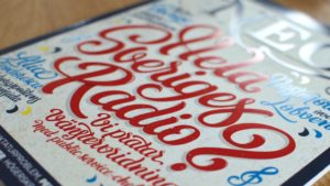
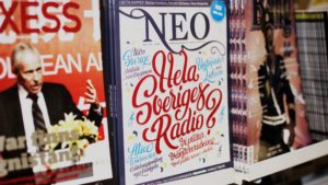
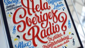
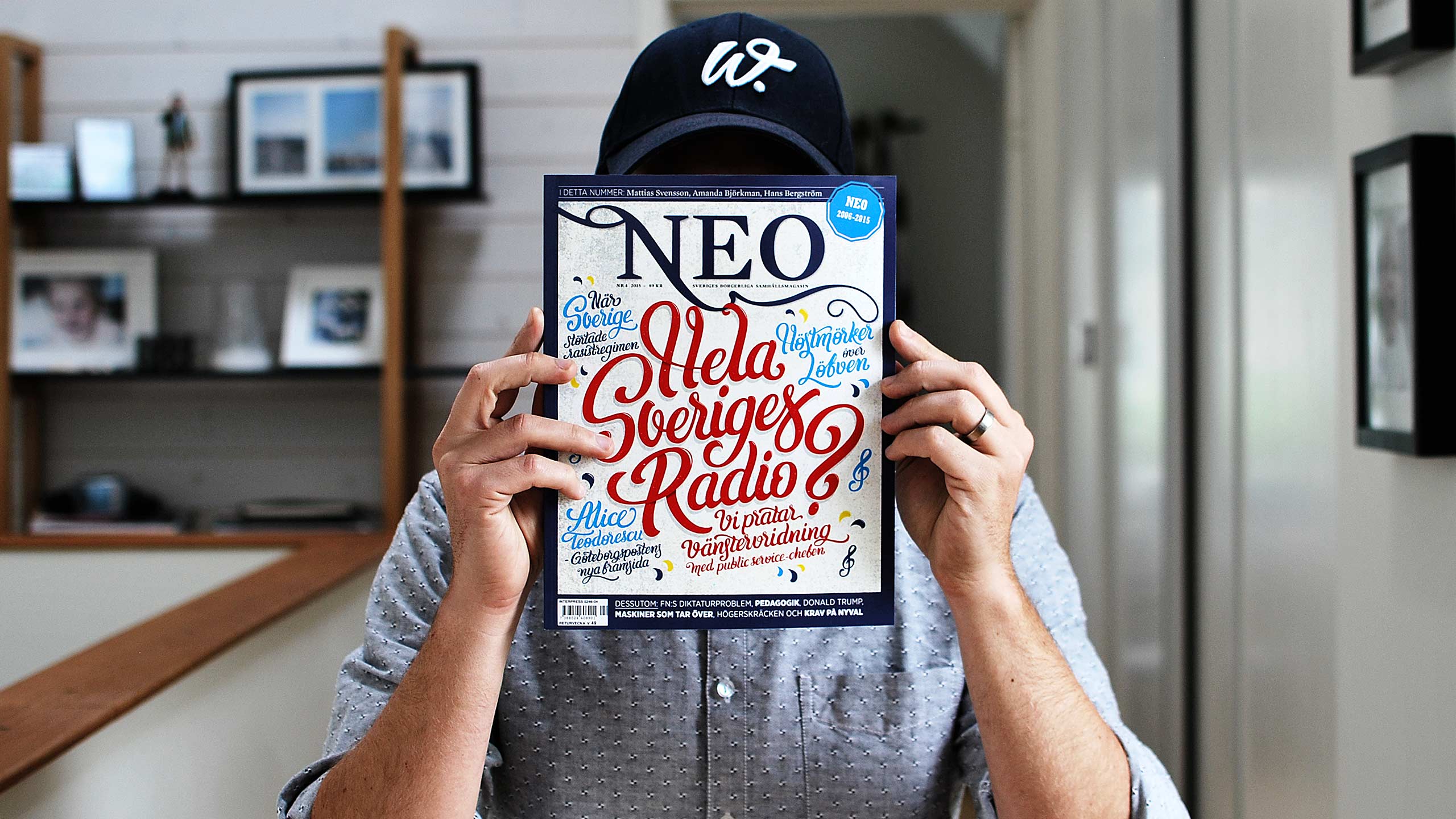
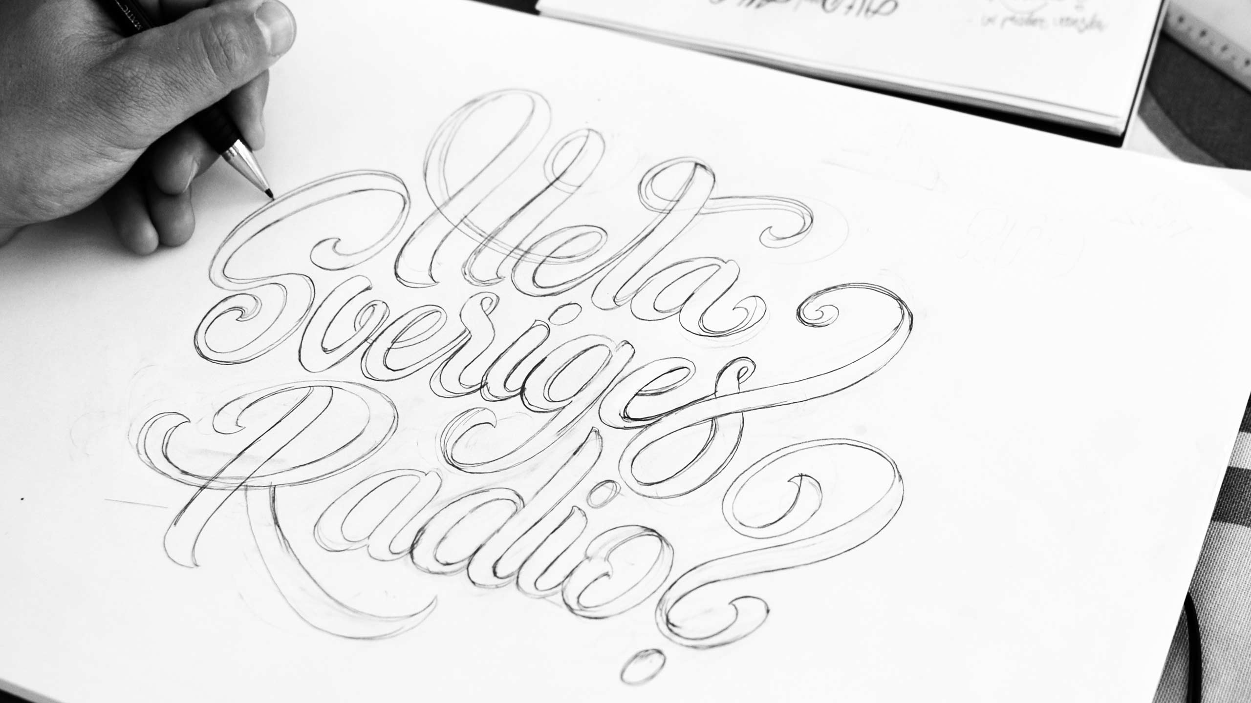
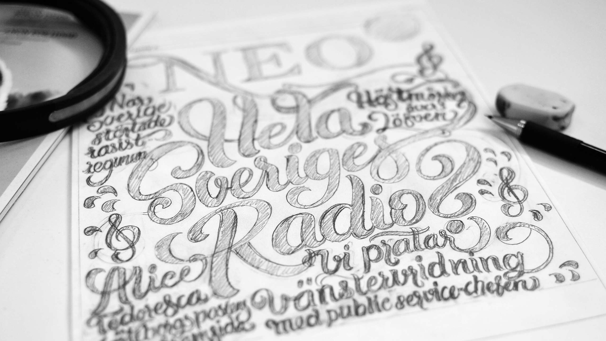
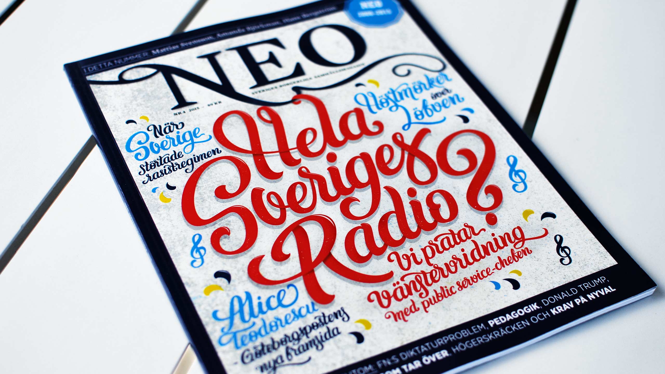
After initial discussions I was given pretty much free hands to create a totally hand-drawn typographic cover. My initial focus was to find a suitable style. I researched a lot to find the right type of lettering and the effects that I wanted. The chosen lettering style suited the vision of the magazine and also has a subtle familiarity to the NEO logotype. I started drawing the main headline. Next step was to find a good layout and create the hierarchy between the main headline, its subheading and the smaller headlines. To avoid the cover to be cluttered I used four fixed sizes of letters. I also added some suitable illustrative elements to fill the blanks in the cover. To highlight the main headline even more I added shadows, et c.
Lina came up with a rough colour scheme that I implemented. The background has a subtle gradient and a combination of different textures in order to give it more depth. All type was initially hand-drawn by pencil and then refined digitally. For the printed cover the headlines are covered with UV varnish.
Result
This issue of Magasinet NEO sold 10% more than the magazine´s average.
I really recommend Björn. He created a lovely cover illustration with hand-drawn typography. Björn delivered great work, right on time. I suggest you go hire him!”
Lina Högberg,
Art Director at Magasinet NEO


