Challenge
Redesign the logo for Magic Beans Productions – a production company that creates tv ads, programs, series and soon also movies. Main customers are advertising agencies and tv channels. The customers care about results and quality. Key players in tv ads segment are The Talkies, Good People, ASAP, The Producers and The Film Marshals. For tv programs and series the competitors are Blink, El ADL group, S Productions and JWT Entertainment. Words that should be associated with the brand are passionate, young, updated, unique and reliable.
Solution
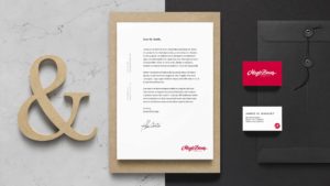
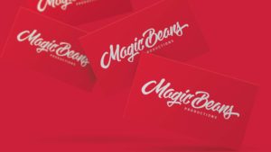
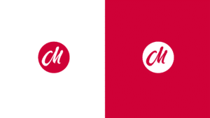
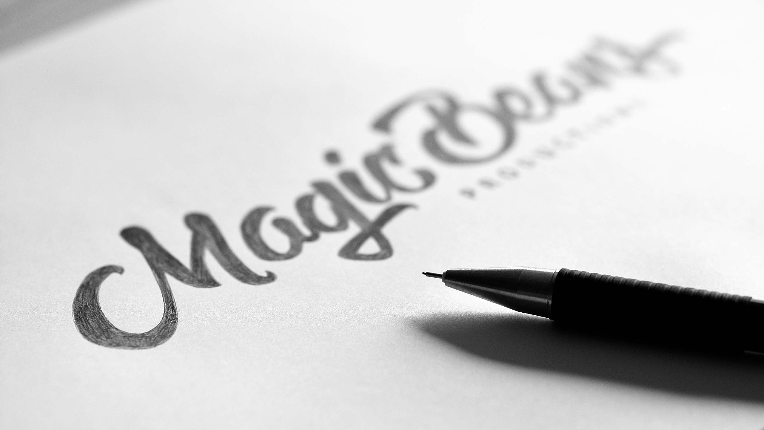
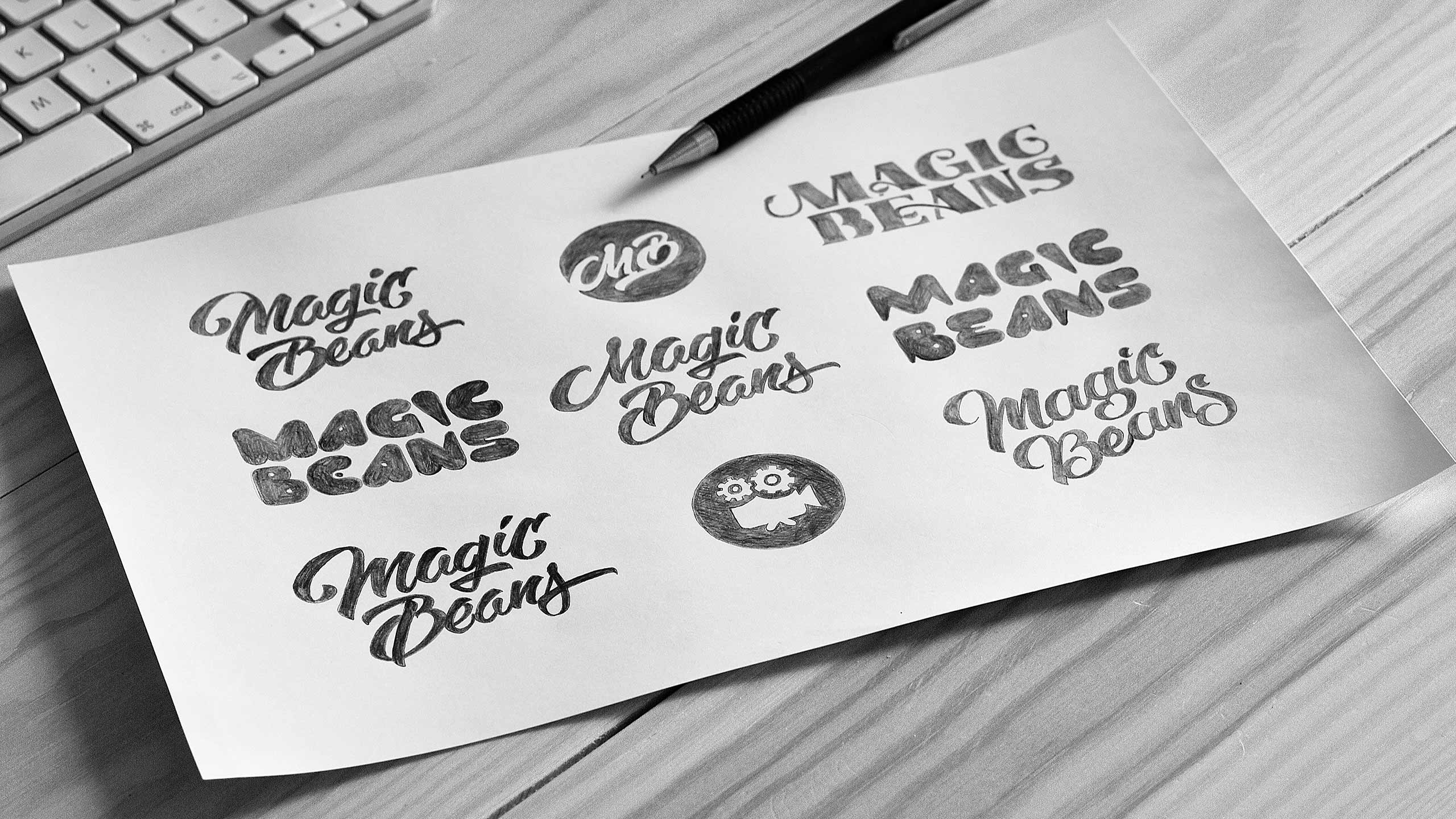
I wanted to make a connection to the name ‘Magic Beans’ by having a dynamic, living and organic lettering. Top quality lettering to establish the reliability. The slightly italic look gives the lettering energy, passion and a modern feeling. The whole logo is unique and stands out compared to the competitors. The dynamic, energy-filled lettering together with a strong colour (keeping the red from their old logo) separates Magic Beans from competition – they stand out. The logo redesign is consciously pretty bold and simple in shape in order to make it legible, but also easy to animate and use in all sorts of media. An all hand-drawn logo ensures that it is unique and stands out.
I have received a whole lot of positive feedback since the release of our new logo. I loved how Björn researched the market and our competitors to find a solution for us that stands out. He had reasonable pricing and I always recommend him when someone is in a design need – everybody deserves a great logo!”
Ahmed El Ganainy,
Producer at Magic Beans Productions


