Challenge
Rolf Johannessen, founder of Penman, reached out to me regarding the need of updating the visual look of their line of product brochures. Penman focus on selling education products for schools – from preschool to high school. The old brochure designs had through the years lost both their looks and also the hierarchy and structure needed to make them a pleasure to read for the customers. Teachers are the primary customers.
Solution
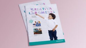
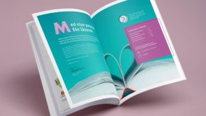
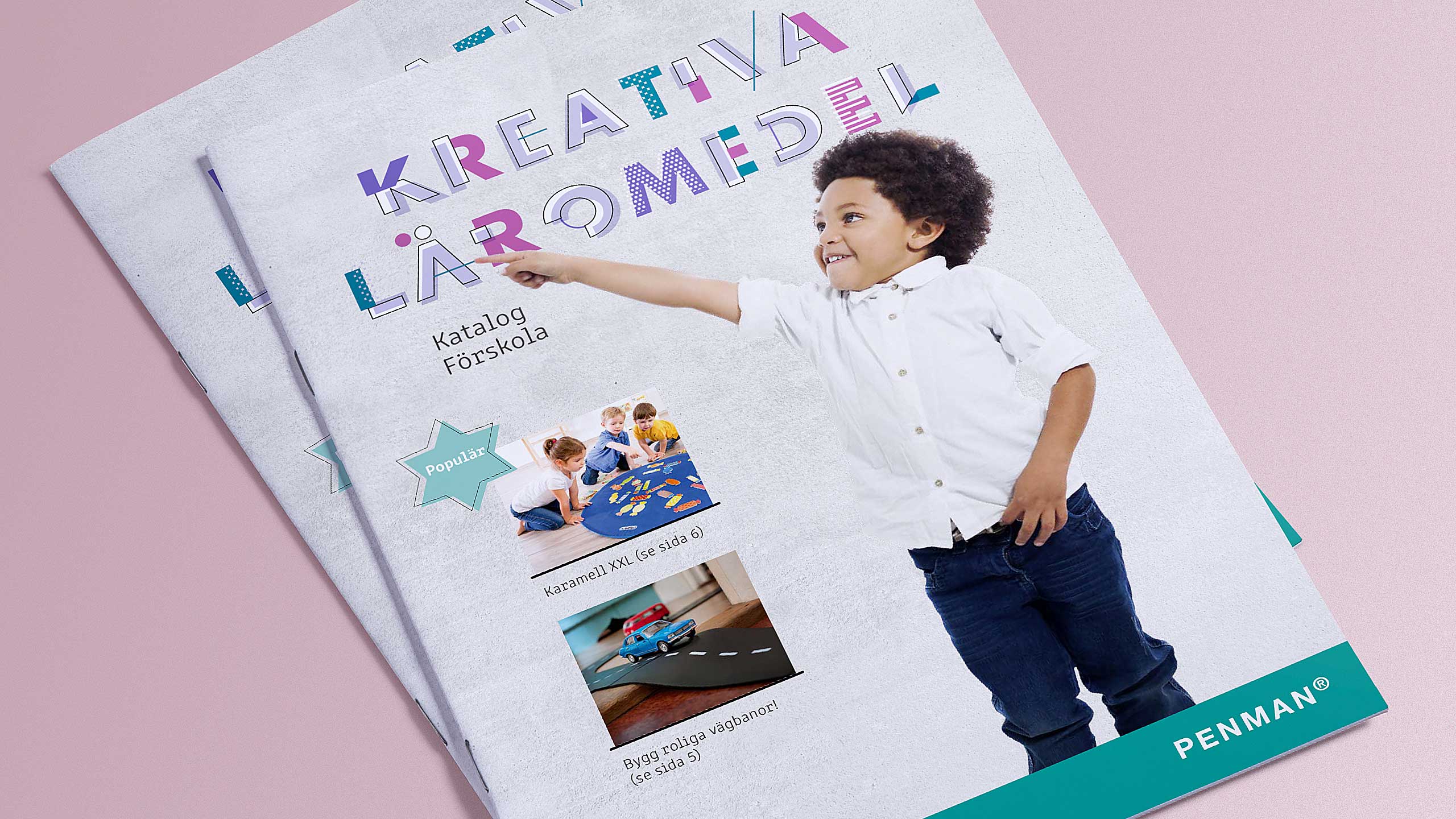
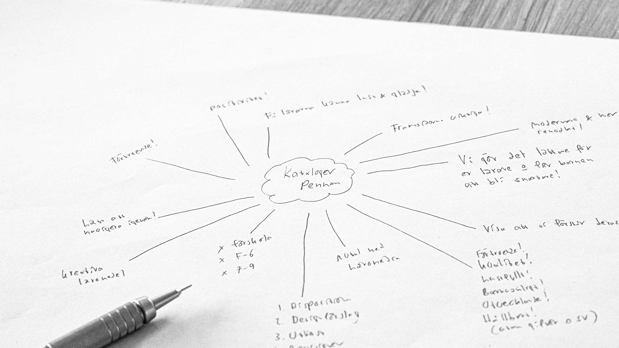
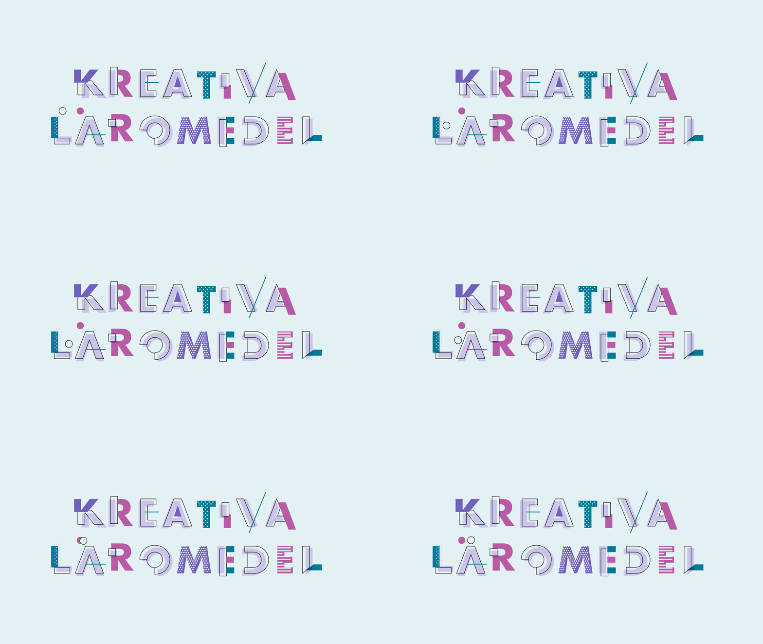
I started on researching competitors and how promotion material within this segment usually look and feel. I brainstormed and put a lot of thought into Penman’s tagline ‘Creative teaching materials’ (‘Kreativa läromedel’ in Swedish). After gathering inspiration through different sources, I landed on a creative concept based on learning, fun and creativity. The cover design features a student that interacts with the tagline (which was illustrated in playful way). Also, with respect for the teachers, whom work under constant time pressure, the product pages are deliberately very structured in order to make it easy to navigate and find what you need.
Furthermore, I created a group of contemporary illustrations to use in order to decrease clutter and make the look even cleaner and easier to navigate. The overall design re-establishes Penman as a quality supplier of pedagogical and educational products. The collaboration with Penman is a long-term ongoing relationship, we have been working together since 2017.

I am very positive to your work Björn! I like the fact that you think in new ways and have other view of things in the updated design. The look and feel feels contemporary, fresh and you have made it with great respect for the target group. Thank you very much!”
Rolf Johannessen,
Founder of Penman AB


