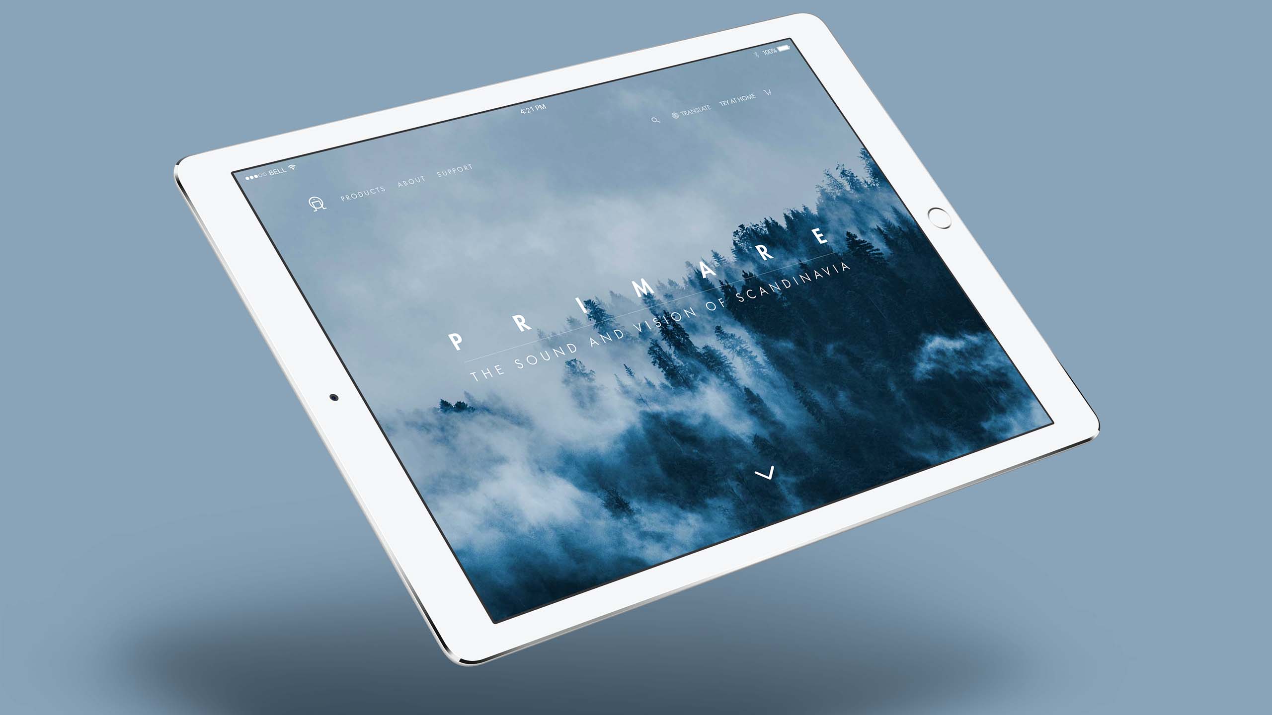
Challenge
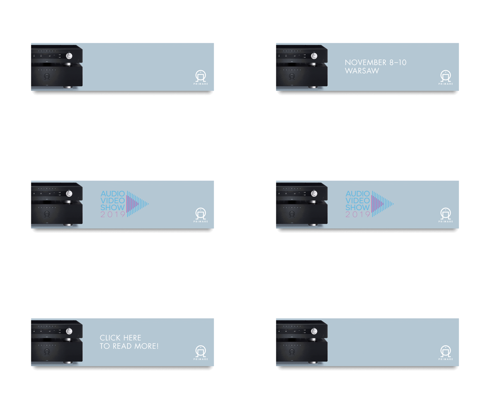
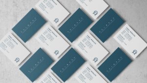
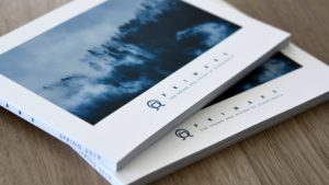
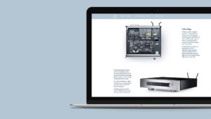
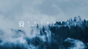
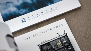
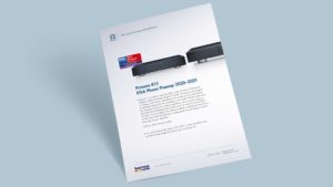
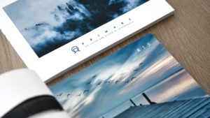
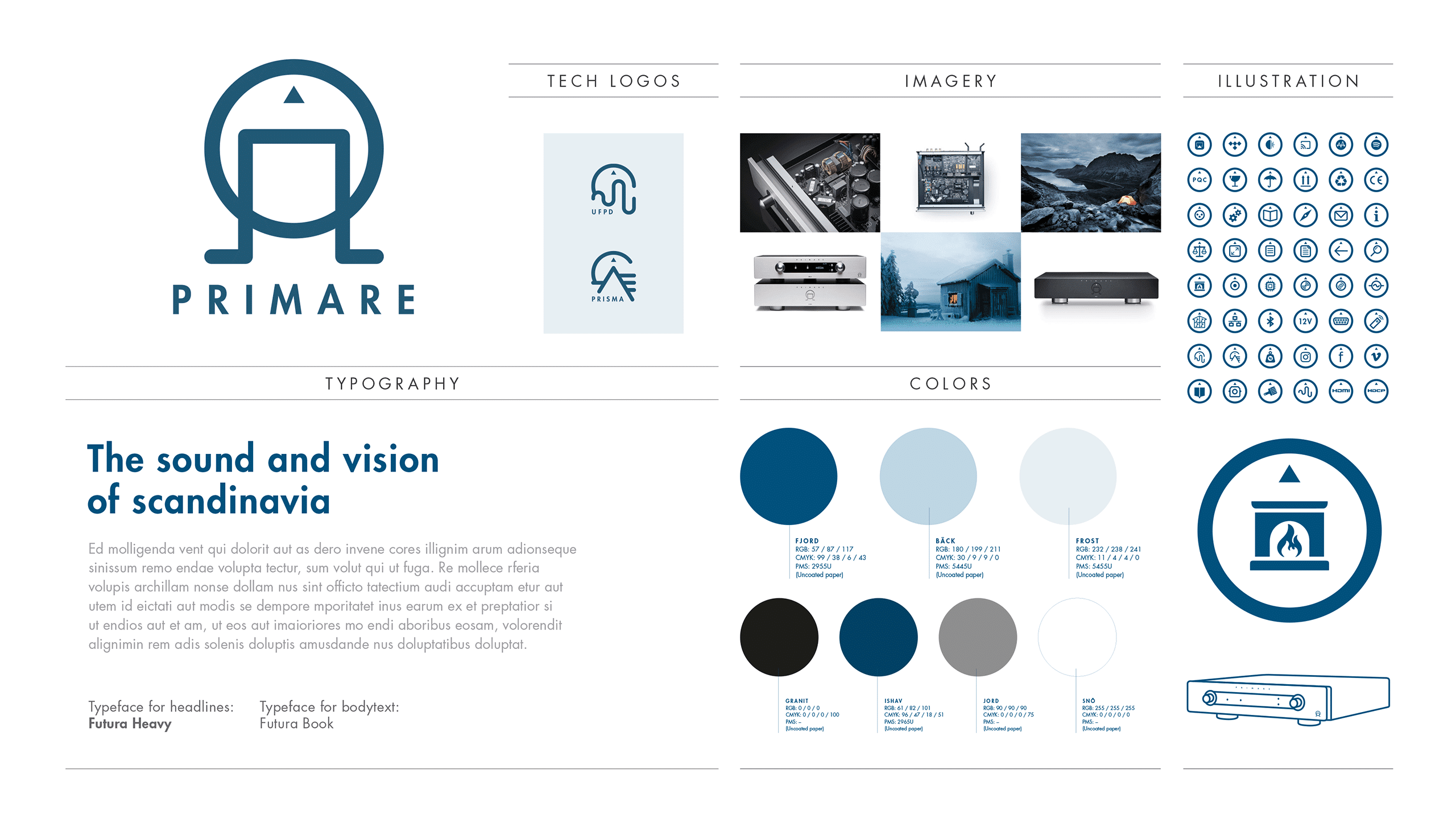
Create a visual identity redesign for award-winning hi-fi designer and producer Primare – including a new look & feel, a brand-new website design and two technology logotypes. The primary goal with this redesign was to reinforce the Scandinavian look and feel of the brand. The old look lacked the spirit and visuals of the north.
Solution
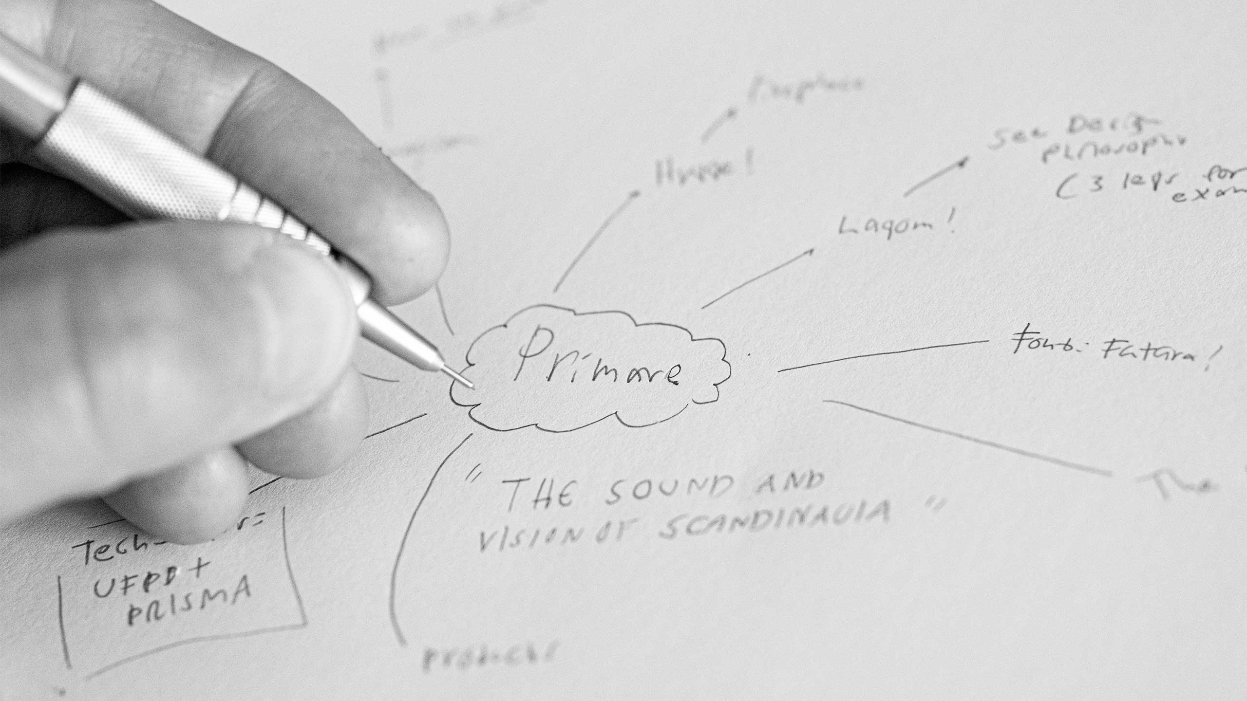
The solution is an updated, more contemporary and more Scandinavian looking visual identity. During the process pretty much everything has been replaced, changed or added. But one thing has not changed. We decided to keep the existing logo, based on two reasons; first of all, the logo design rhymes well with the new look and Primares’ existing tagline “The sound and vision of Scandinavia”. Also, the Primare logo and logo symbol are well-known in the industry. The collaboration with Primare is a long-term ongoing relationship, we have been working together since 2015. View the website design for Primare here.
Björn, you have truly brought tears to my eyes with these great designs. I can’t express how much I appreciate your good work!”
terry medalen,
marketing at primare ab
Friends
The development of the website has been made by Peter Anderhagen at Abrovink Interaktiv Media AB.
