Challenge
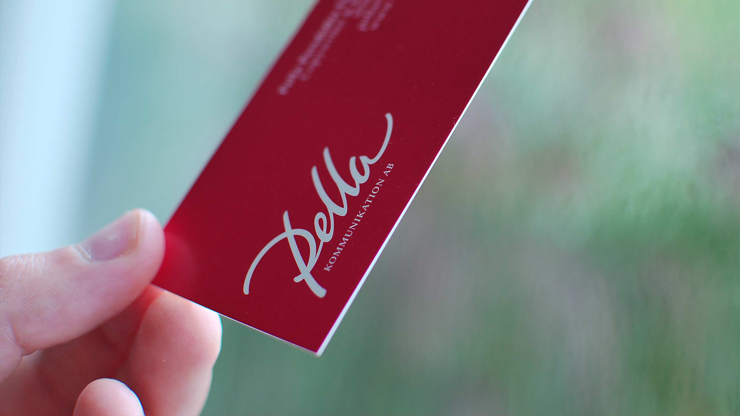
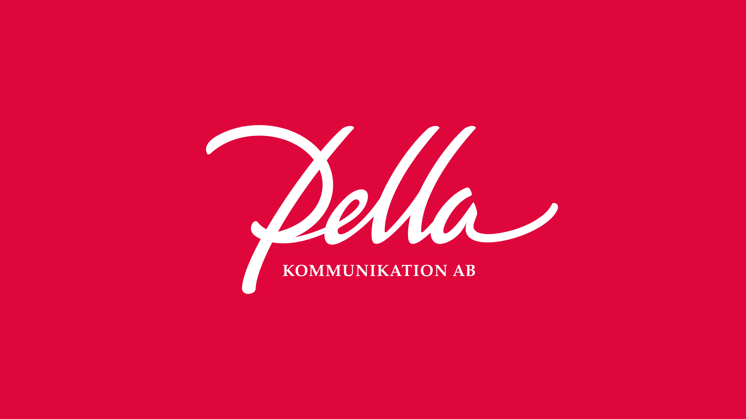
The newly started one woman show Pella Kommunikation AB needed a logo. The main service of the company will be copywriting, but Pella will also offer consulting in communication. She wanted the logo to be based on her own signature. Her idea was to have ‘Pella’ in a more extrovert style and ‘Kommunikation AB’ in a more strict, classic typeface.
Solution
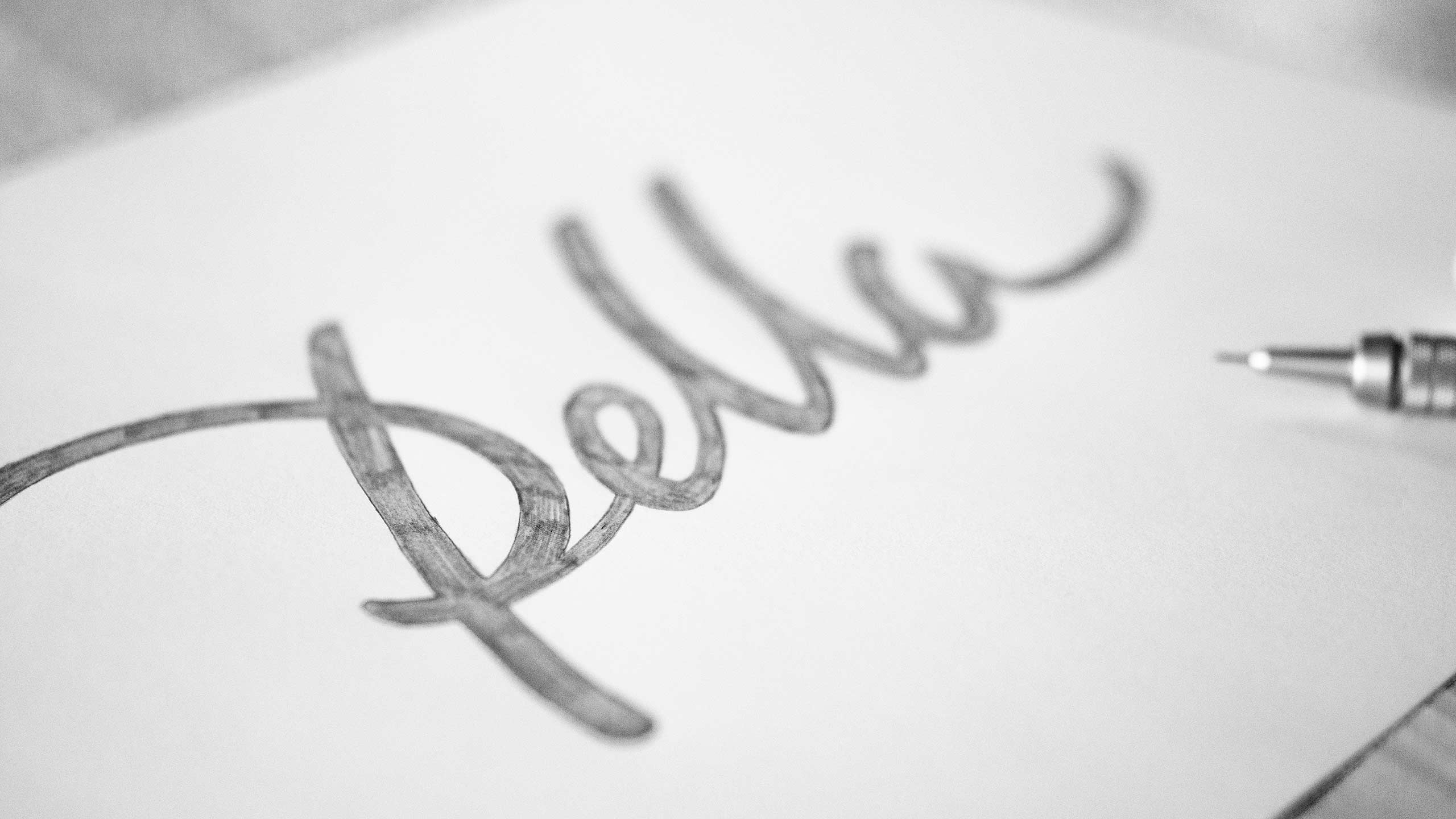
Knowing Pella very well, I intuitive went for a dynamic and clean hand-drawn version of her signature. Modern, yet timeless, with an ounce of 50´s design. Slightly cursive for a subtle feeling of drive and passion. Palatino Linotype was used for the text ‘Kommunikation AB’. The chosen color, sort of raspberry red, is warm, lively and alert. I truly believe the new logo captures the talented person behind Pella Kommunikation AB.


Spontaneously – I love it! It feels like me and it seems like you understand me!”
Pella Persdotter Feldtmann,
FOUNDER oF Pella Kommunikation AB

