Challenge
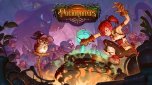
Create a logotype for Voracious Games first video game named Potionomics. The word Potionomics is a hybrid between the two words ‘potion’ and ‘economics’. The game is an RPG / Business Simulation game where a player’s narrative choices (and vice versa!) affect the economy of their kingdom and the lives of those who dwell in it. The game features a customizable 3D potion shop as well as a cast of colourfully animated characters inspired by the animation styles of Pixar and Studio Ghibli. Players assume the role of Sylvia, a penniless witch who must raise money to save her debt-ridden potion shop from evil loan sharks. Along the way, players will encounter mighty (and not-so-mighty) heroes, classic RPG creatures, and a powerful wizard trapped in an owl’s body. As every aspiring entrepreneur knows; customers will be fickle, competition will be fierce, and prices never stay stable. Add in some magic and you have a recipe for a magnificent adventure unlike any you’ve ever played before.
The primary target audience are women in the age of 17 to 26 years old. They are players who enjoy artistic, beautiful games and business building gameplay. The ones most close to Potionomics gameplay are games that blend narrative and gameplay together, for example Recettear, Papers Please, Undertale, Holy potatoes – A weapon shop and Pocket: Potions (although Potionomics have full 3D graphics).
Competitors are also all the tycoon games and economy simulation games (although they focus more on business building and less on narrative). Other competitors are of course the narrative-based games like Telltale games, Life is strange, Grim Fandango, Clannad, Visual novels and also RPG´s (although they have very less gameplay). Voracious Games take inspiration from animated films studios (like Studio Ghibli Movies, Pixar Films, DreamWorks Movies and Disney Films). Voracious Games wanted a light-hearted, none-violent look.
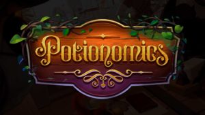
The lettering should work both on its own, but also in the centre of a composition consisting of surrounding illustration elements and a shop sign. The lettering should be modern, clear and interesting. The title should diverse itself from casual games (like for example Candy Crush).
Solution
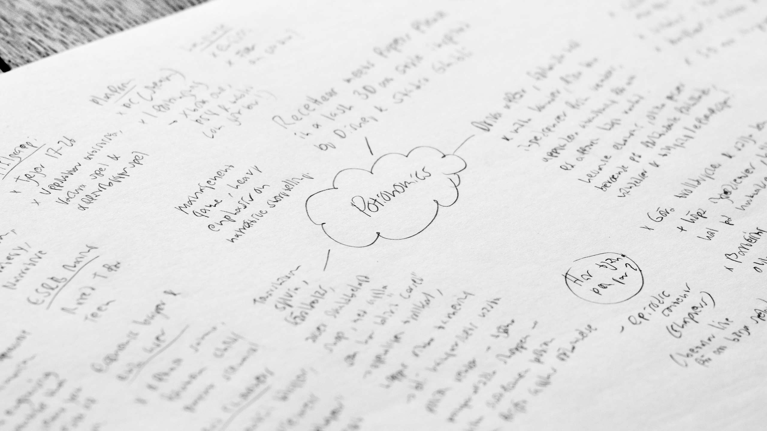
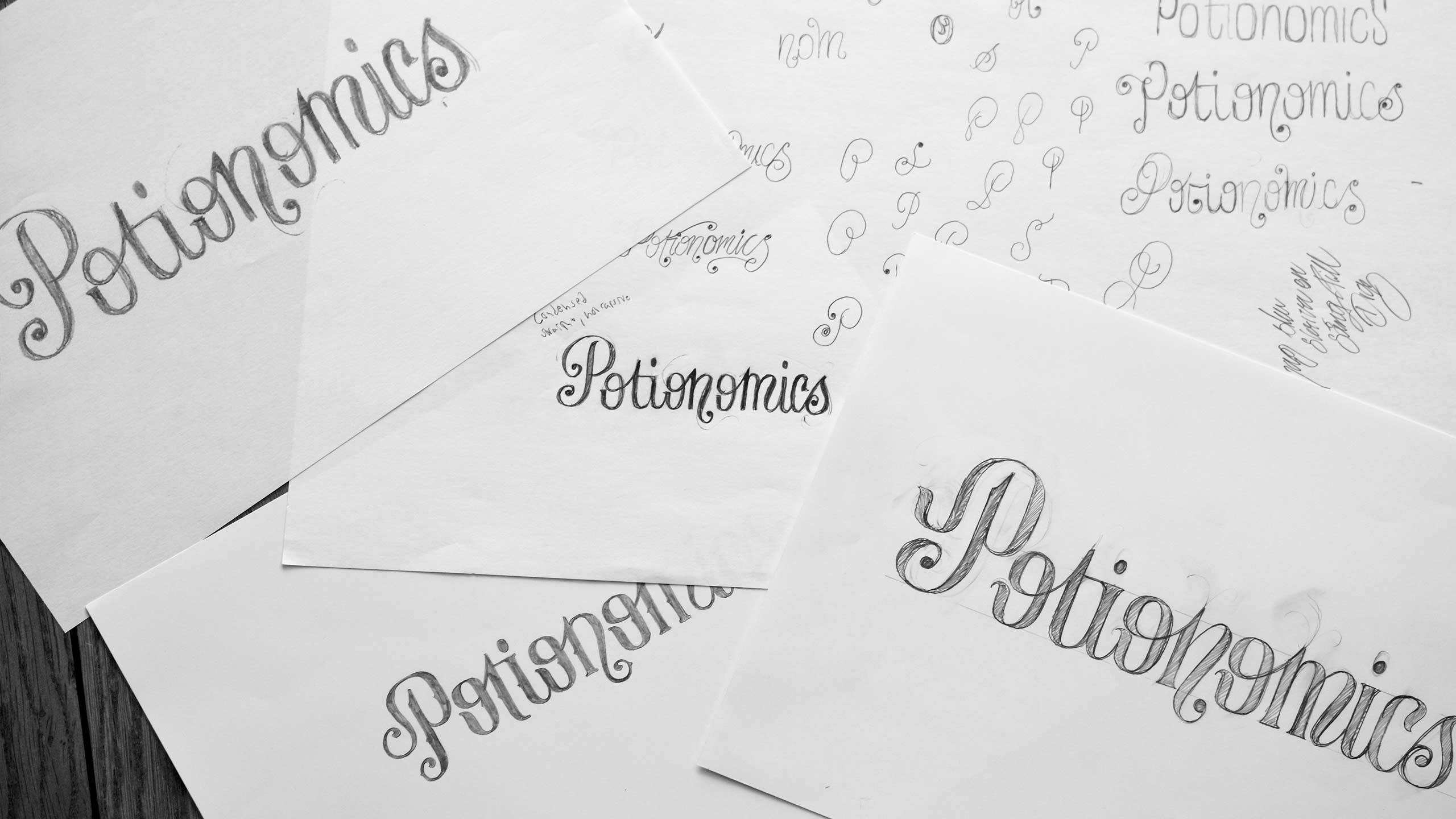
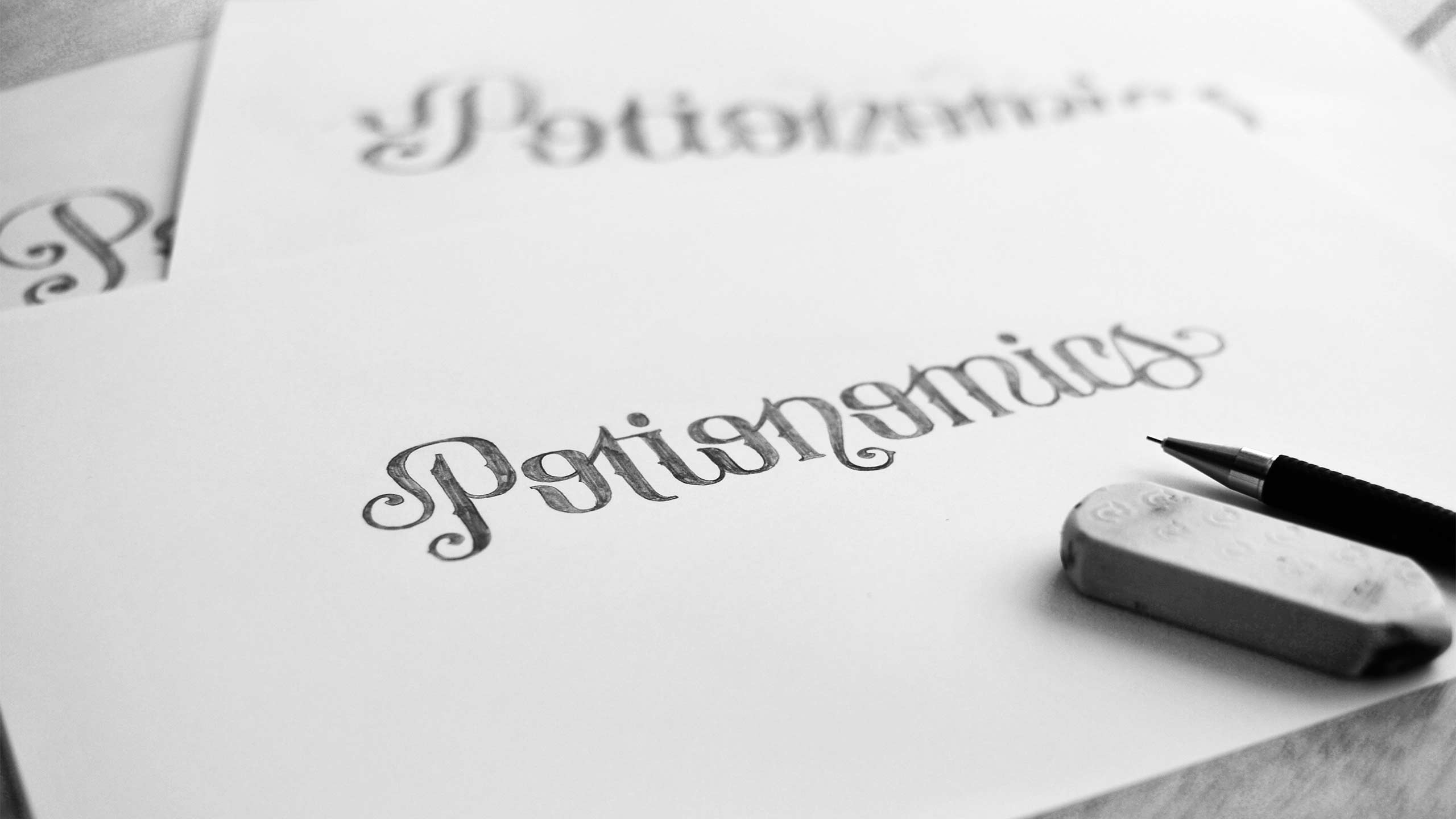
The hardest part in this challenge was to find the right tone, i.e. finding a unique look that felt ‘witchy’ but not too hard or evil-looking. I wanted an expression that made you think about wizards and magic. I also wanted the lettering to fit with the company logo, that lead to the decision to having a straight baseline for the letters. After a lot of research, viewing competitors and a lot of sketching, I finally found a direction that felt right. The video game logo design for Potionomics fits in by feeling like a video game logo, but at the same time it stands out – both to other competitors but also, which were important, from casual games like Candy Crush. The logo is detailed, but still easy to read and easy to use – both as a stand-alone design and as in the illustrated version (see image further down).

Copyright game screenshots: Voracious Games.
The team and I think the logo looks fantastic!”
Aryo Darmawan,
Voracious Games


