Challenge
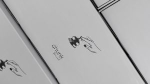
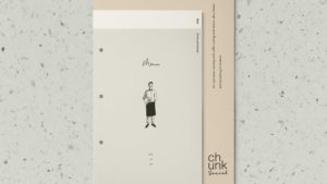
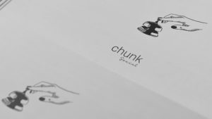
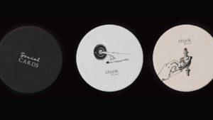
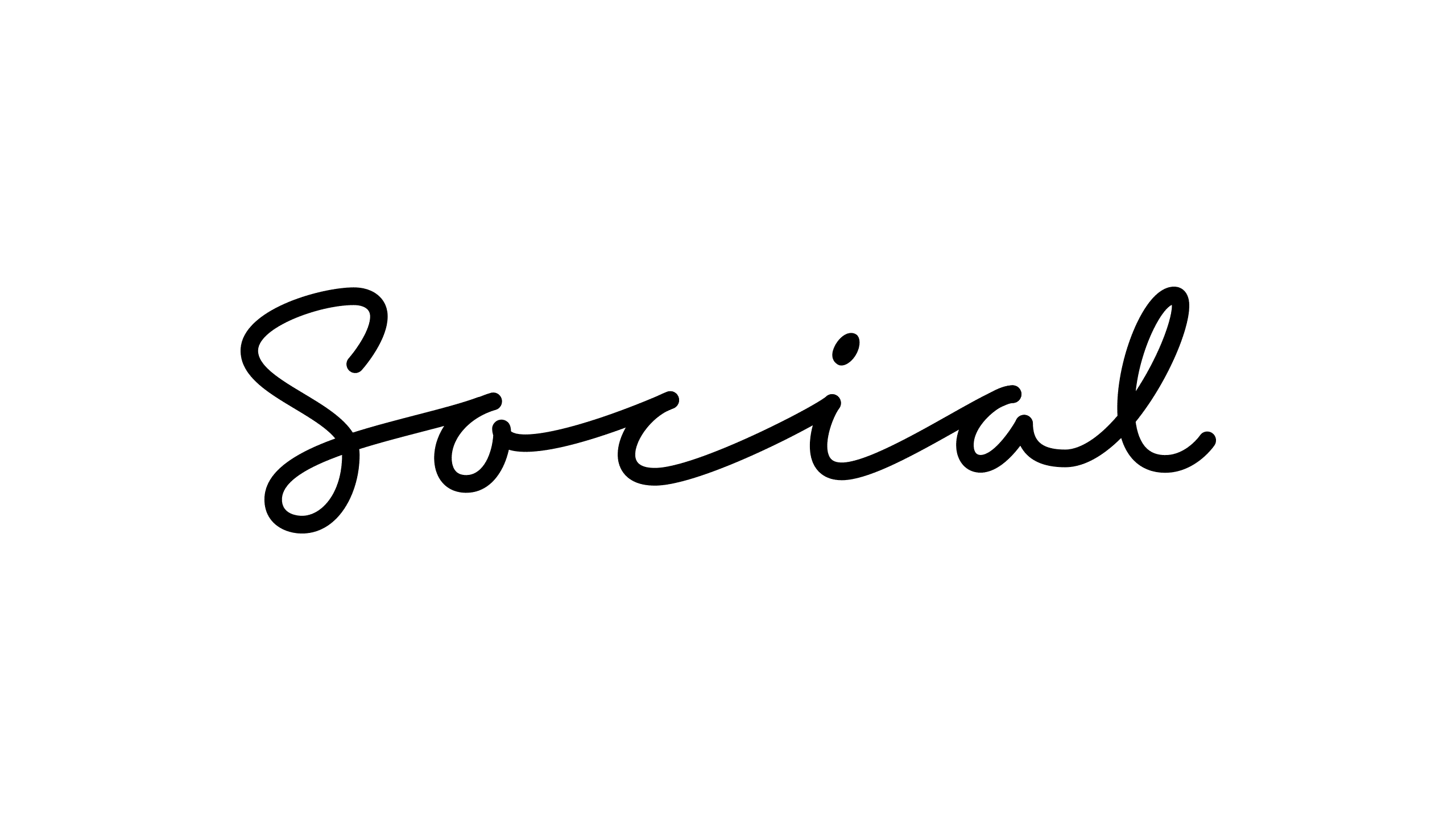
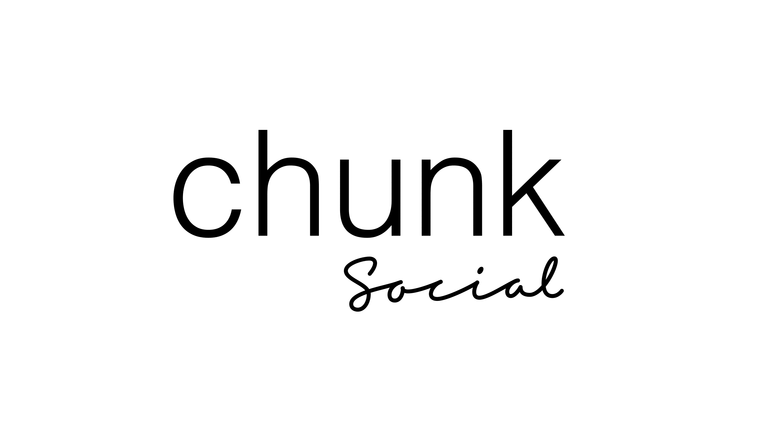
Nada AlArjani, CO Founder & Account Manager of LOT studio, reached out to me for lettering assistance. For their customer Chunk Bakery & Café and their new concept Chunk Social they needed a monoline script lettering version of the word ‘Social’. LOT studio tried using fonts but found no 100% match – which meant that this was a perfect assignment for lettering.
Solution
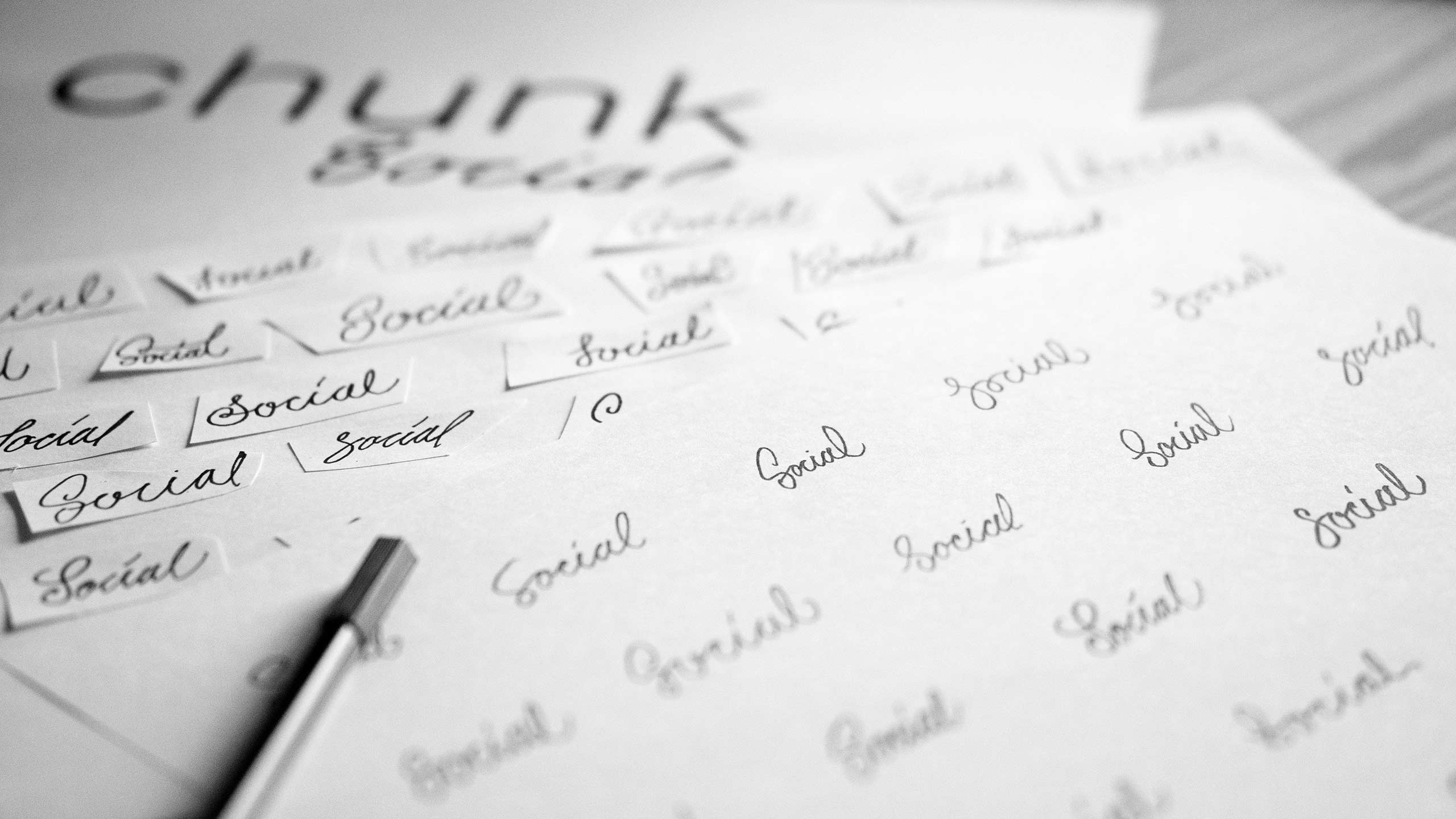
Since I already had a specific style set for the final lettering, I started my work with tons of sketches within the chosen script style. After refining some sketches and scanned them, I vectorised the options. After a few revisions we landed in a casual and “flowy” wordmark that has an uncomplicated and “not-so-polished” expression. Thinner is usually more elegant. And more spacing between the letters also adds elegance. I believe that a bit more spacing between the letters suits the Chunk letters, that are also a bit expanded. Also the lower x-height in combination with this fills out the horizontal space well, makes the Social part of the logo smaller but still large enough without taking over the main logo. All type was hand-drawn and then refined digitally.

We love the final version, and we also look forward to collaborating further in the future!”
Nada AlArjani,
CO Founder & Account Manager at LOT studio
Friends
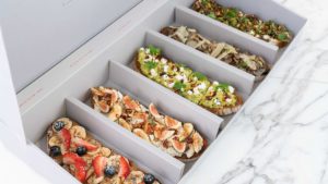
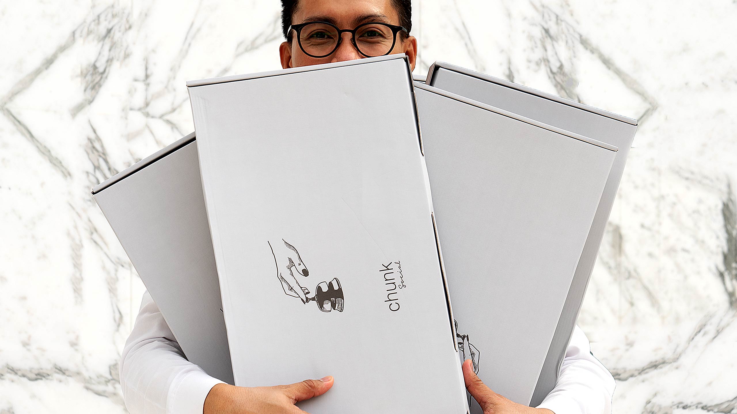
Packaging photography by Ali Almatruk. Illustration and overall design direction: LOT studio.


