Challenge
Create a visual identity and logo for Two Tales, a newly started film production house. The primary customers are other production houses, not clients directly. Key words for Two Tales are strong, bold, contemporary and quality.
Solution
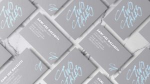
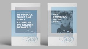
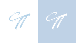
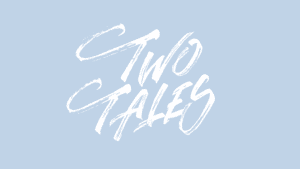
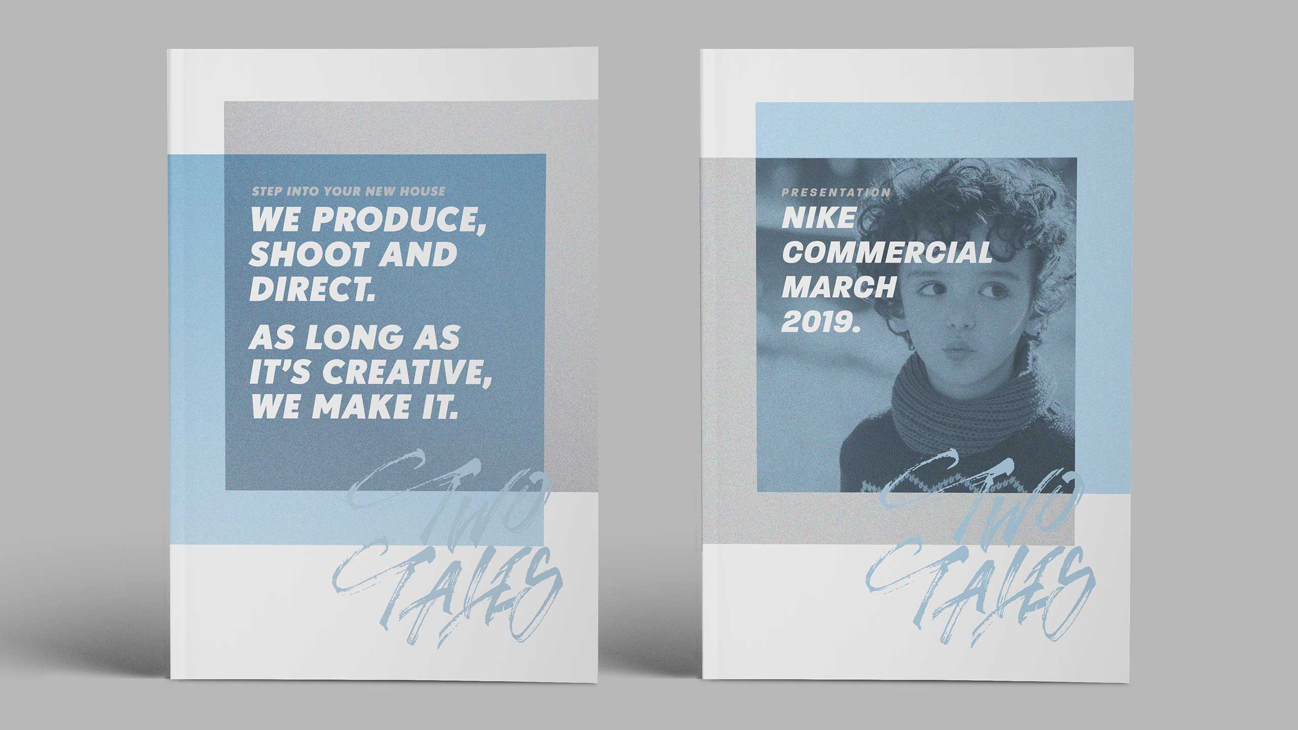
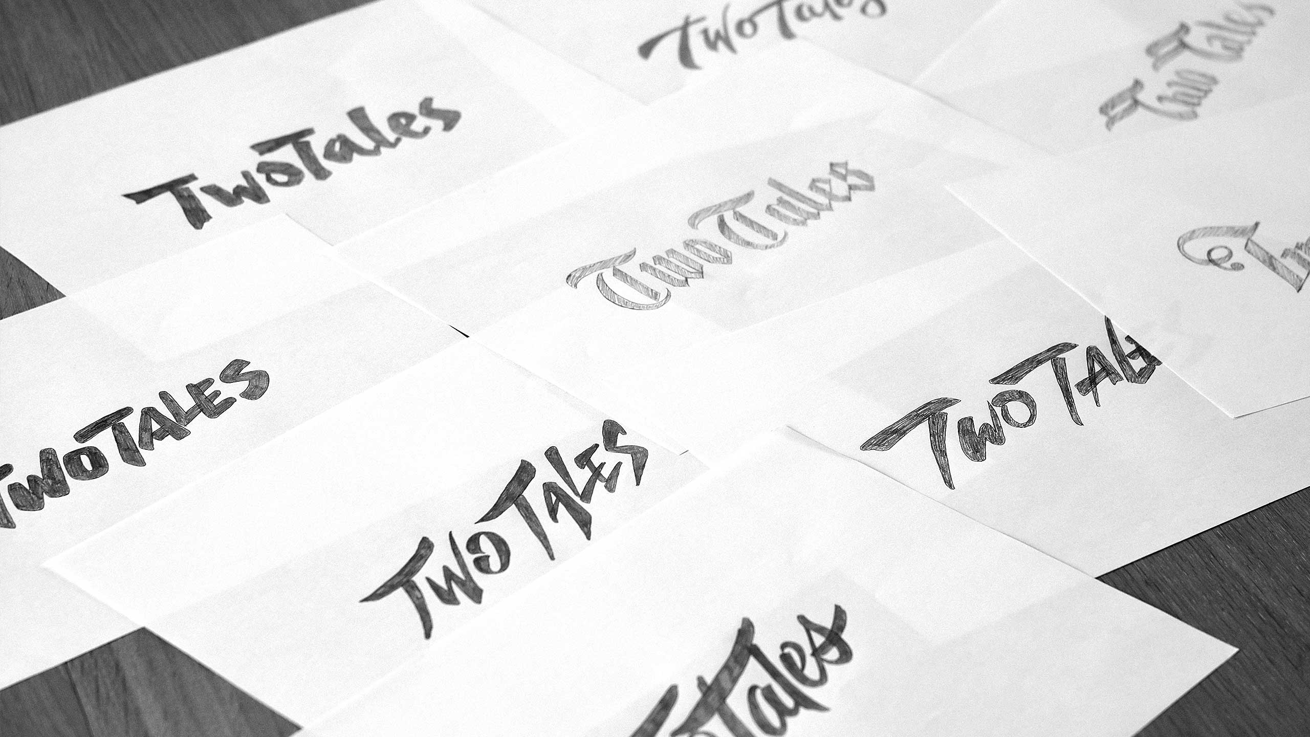
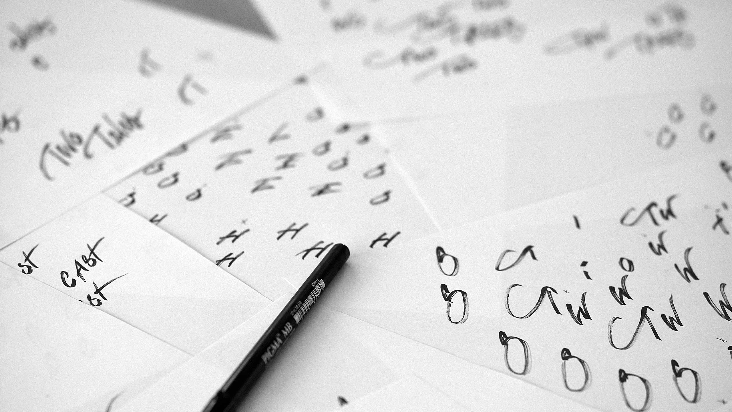
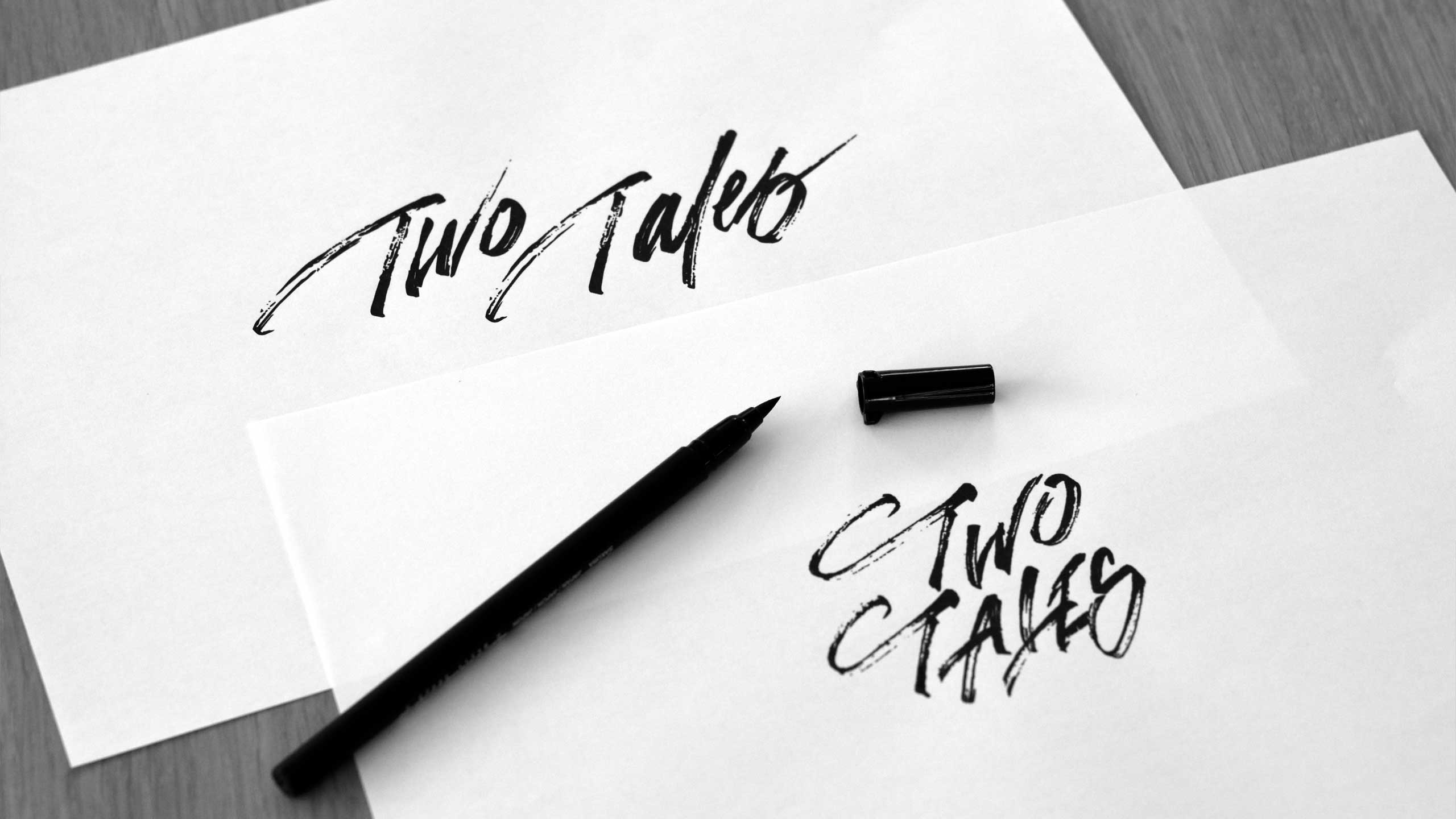
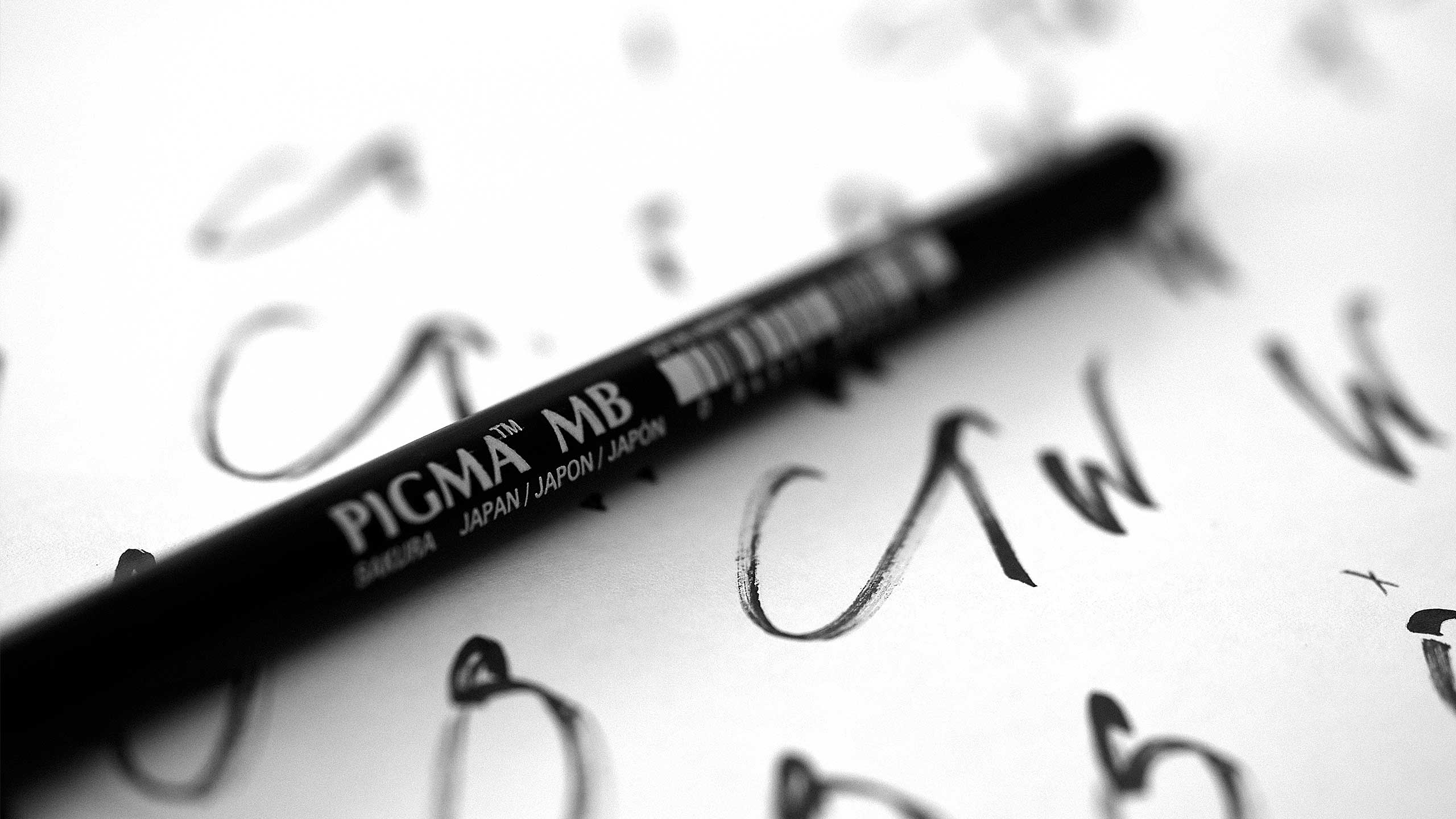
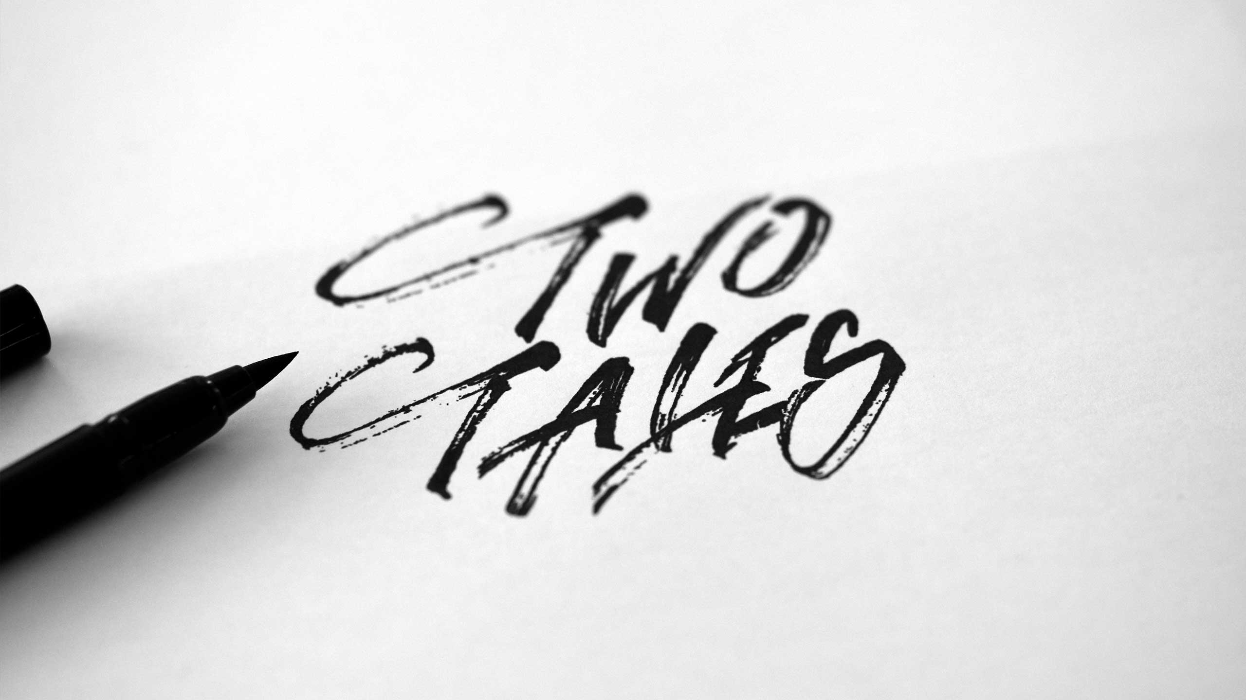
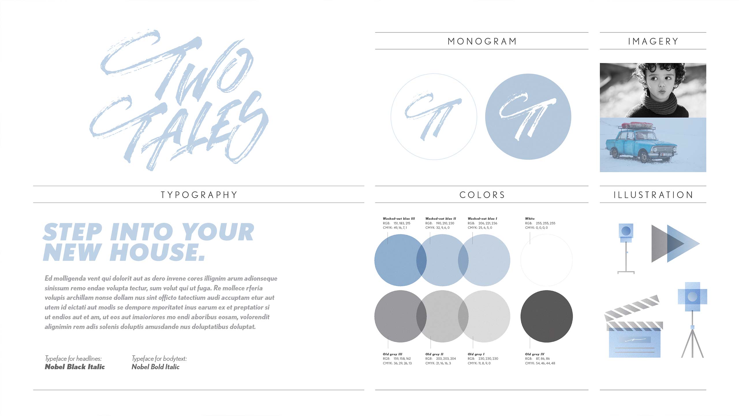
The identity has a strong and bold look. I wanted a living identity that connects to the viewers. After experimenting with different looks for the logo, the chosen direction was a hand-drawn (drawn with a Pigma MB Sakura Japan brush pen). This solution has a unique driven expression with a clear visible brush texture. Combined with a clean sans serif as a brand font, the identity gets an interesting bold look and a unique expression.
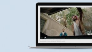
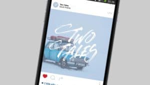
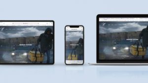
The colours chosen has vintage vibes but feels overall contemporary when combined together with the other elements of the visual identity. I have worked hard to create an identity that you can place branch-wise (i.e. it feels like a company in the creative business) but at the same time signals something new and exciting. The identity is stylish and clean, but at the same time also bold and strong. As every well-crafted logo shall be, the Two Tales logo is easy to recognize and remember, even in cost-effective one colour print. Also, it works well in the shorter monogram version for social media and other small size places. The project also included creating a complete web design for Two Tales.
Amazing stuff as always Björn! Thank you again for everything. We at Two Tales, and client’s we have shown it towards, are loving the identity and the website!”
Sami Joe
Co-founder of Two Tales
Friends
The development of the website has been made by Peter Anderhagen at Abrovink Interaktiv Media AB.


